| Author | Thread |
|
|
04/03/2007 07:38:04 AM |
Greetings from the Critique Club.
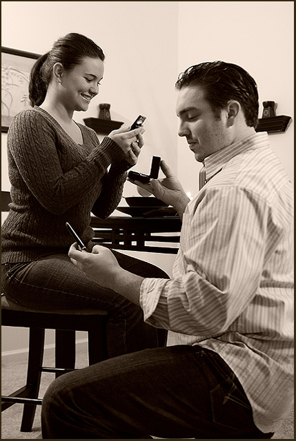
Very funny picture - this was one of my favourites in the challenge (partly because it was a nice change from seeing yet another cute kid on phone). Congratulations on the originality.
The lighting is good, the positioning of the models seems just right, and I love the expression on the girl's face. However, as has been commented on before, the background is unnecessarily cluttered. The ring should be in a slightly more central, prominent place, and there's no real reason for the plates on the table and the stuff on the walls - it doesn't add to the picture, it just acts as a distraction. The line of the wall corner going past the guy's head isn't ideal either - really, just a table and a blank piece of wall would have served the purpose much better. Also, I think cutting off the guy's back works well, but I'm not sure about cutting off the girl slightly - since she's the one receiving the proposal, she should possibly be included completely in the picture.
I think the post-processing is very good. The border is just right - it frames and controls the image without dominating it as borders often do. Sepia is a matter of personal taste and doesn't necessarily have universal appeal, but I happen to quite like it.
Anyway, well done on an interesting image.
Any questions - just PM me.
Jelena |
|
 Photographer found comment helpful. Photographer found comment helpful. |
Comments Made During the Challenge  |
|
|
03/27/2007 07:43:02 PM |
| That's really the ultimate! Love the crazy idea, and it's well done too. |
|
| Photographer found comment helpful. |
|
|
03/26/2007 10:51:29 PM |
| Funny shot & great idea. For staging this more background stuff could have been taken out. Have to look twice to notice the ring. - 7 |
|
| Photographer found comment helpful. |
|
|
03/24/2007 09:26:54 PM |
|
| Photographer found comment helpful. |
|
|
03/23/2007 03:37:27 PM |
| Definately a sign of the times... although I'm surprised neither is getting a picture of the other person or the ring. I like the B&W and the composition, expect for the little wall shelves growing out of their shoulders like gaurdian angels. |
|
| Photographer found comment helpful. |
|
|
03/23/2007 10:45:23 AM |
| bet this has happened, too! 8 |
|
| Photographer found comment helpful. |
|
|
03/23/2007 01:21:33 AM |
|
| Photographer found comment helpful. |
|
|
03/22/2007 05:29:14 PM |
| Haha, that's great, very clever! |
|
| Photographer found comment helpful. |
|
|
03/22/2007 11:09:59 AM |
| love this. good composition, lighting, and angle. great job! |
|
| Photographer found comment helpful. |
|
|
03/22/2007 10:55:14 AM |
| Well, thats a lame proposal. Good picture. I like the angle you shot it from. |
|
| Photographer found comment helpful. |
|
|
03/21/2007 10:56:57 PM |
| this picture is just sad; where is the romance? |
|
| Photographer found comment helpful. |
|
|
03/21/2007 09:06:22 PM |
| Now this is clever. Way to go on such a seemingly mundane subject! |
|
| Photographer found comment helpful. |
|
|
03/21/2007 01:43:09 PM |
| What?! That's horrible! But, I'm laughing...oh well. 9 |
|
| Photographer found comment helpful. |
|
|
03/21/2007 11:30:58 AM |
|
| Photographer found comment helpful. |
|
|
03/21/2007 11:20:50 AM |
| lol. I love the cleverness behind this photo. |
|
| Photographer found comment helpful. |
|
|
03/21/2007 10:41:05 AM |
|
| Photographer found comment helpful. |
|
|
03/21/2007 10:36:16 AM |
| omg i hope not. at least if she says no, she can text and run. cute idea! |
|
| Photographer found comment helpful. |
Home -
Challenges -
Community -
League -
Photos -
Cameras -
Lenses -
Learn -
Help -
Terms of Use -
Privacy -
Top ^
DPChallenge, and website content and design, Copyright © 2001-2025 Challenging Technologies, LLC.
All digital photo copyrights belong to the photographers and may not be used without permission.
Current Server Time: 03/15/2025 10:23:38 AM EDT.