| Author | Thread |
|
|
04/06/2007 01:00:46 PM |
greetings from the critique club!
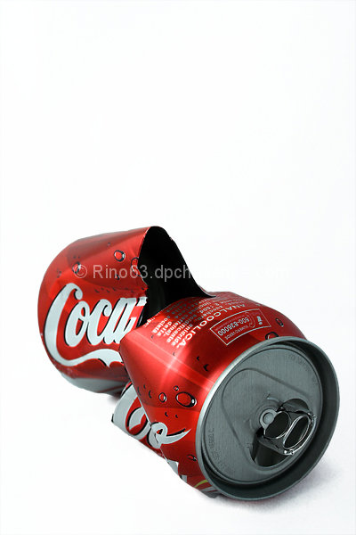
You should be proud of your "technicals" on this shot because they're perfect and they're the only reason you scored as high as you did. I consider the ripping of the can part of your technicals: it creates a curved more interesting surface for catching highlights. But there's no other reason for it. It doesn't convey "pop" in any way, unless you think the can popped or somesuch? The only thing you have conveying "pop" is a can of Coca-Cola, the single best known brand in the world, so it does meet the challenge but not in an original way. There were lots of Coca-Colas in this challenge, as I knew there would be.
The free space on the top serves no purpose. I just made a funny realization. I notice how often DPCers leave blank space in photographs, and now I think it is because they are emulating advertisements. But the only reason advertising photos leave blank space is for text!
|
|
 Photographer found comment helpful. Photographer found comment helpful. |
Comments Made During the Challenge  |
|
|
04/01/2007 11:07:37 PM |
| great shot, nice and smooth, would like to see a but more shadow |
|
| Photographer found comment helpful. |
|
|
03/27/2007 04:40:43 AM |
| Good lighting, crisp shot. |
|
| Photographer found comment helpful. |
|
|
03/26/2007 10:16:21 PM |
|
| Photographer found comment helpful. |
Home -
Challenges -
Community -
League -
Photos -
Cameras -
Lenses -
Learn -
Help -
Terms of Use -
Privacy -
Top ^
DPChallenge, and website content and design, Copyright © 2001-2025 Challenging Technologies, LLC.
All digital photo copyrights belong to the photographers and may not be used without permission.
Current Server Time: 03/16/2025 05:09:30 AM EDT.