| Author | Thread |
|
|
04/26/2007 02:55:20 PM |
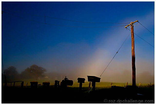
Positives:
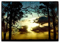
This image has a simplistic elegance to it. The light fog and background trees and grass; and the vivid blue sky and highlighting of the telephone pole go together well. Framing good and one of the few images where wires aren't distractions. :)
Something unusual about your image is that the bright streak up from the boxes is natural. It looks anything but.
Technicals:
The color of blue in this sky is the cement that binds this image together. Nicely done. Brightening the pole is a good idea though it may not be have been done in isolation.
The haloing around the near mailboxes is a major distraction in this composition. The silhouetting of the mailboxes is a good idea but seems a bit wishy washy.
Reading the nice comments I was struck by how different commmenters percieved the image than I did. So I brought the image up on another monitor and made this unusual discovery: There is an astounding difference between how it looks on one monitor from the other. I've known that my normal monitor is a bit on the dark side but I've never seen an image affected by it so much. It is quite disconcerting.
My review is based on the better looking image. ;)
The Challenge:
In Free Study challenges voters expect the highest technical quality in the submissions. You got a 5.2 which is about .1 below the overall DPC average given and about .4 lower than the average given for the challenge you entered it in. That means the group felt it was below overage, but not outragiously so.
It is likely that at least some voters believed the bright streak was added artificially and voted it lowere as a result. The haloing around the mailboxes had a big negative effect on voters. I strongly suspect that others with poorly calibrated monitors would be unable to see the other subtle lighting qualities of this image and vote it lower as a result. That might explain a few of those lower votes, but it looks like a couple "friends" thought it was pretty good though. ;)
Suggestions:
If nothing else, remove the haloing around the mailboxes. That hurt this image moreso than anything else.
Regarding the mailbox silhouette, either go all the way and make it solid black or back off and give the front of the boxes a darkened glow with the detail they have.
Perhaps a 5-10% brightening of the background fog will make it stand out more for added effect. Might want to try cropping off some, not all, of the dark area below the mailboxes.
Outside the distracting border your outtake "Australia" may have been a better submission choice that would have scored higher. BTW, your other outtake is severely overexposed in the center sky. I provided a technique in a critique above that you could use to correct that. |
|
 Photographer found comment helpful. Photographer found comment helpful. |
|
|
04/08/2007 01:07:08 AM |
I think its very cool looking too. It has your touch of combining drama with the beauty around you! Impressive!
|
|
| Photographer found comment helpful. |
|
|
04/08/2007 12:20:40 AM |
| Roz, I think this is lovely, I love the vibrant blues and the beautiful glowing lights. |
|
| Photographer found comment helpful. |
Comments Made During the Challenge  |
|
|
04/07/2007 10:41:41 AM |
| Excellent job of turning the mundane into something interesting. |
|
| Photographer found comment helpful. |
|
|
04/04/2007 04:44:49 PM |
| Beautiful clarity. The light/dark contrast is awesome, as are the colors. Interesting photo. |
|
| Photographer found comment helpful. |
|
|
04/03/2007 09:04:50 PM |
|
| Photographer found comment helpful. |
|
|
04/02/2007 08:53:30 PM |
I love the fine misty look and the burnt dusty colors.....
Nice lighting as well..... |
|
| Photographer found comment helpful. |
|
|
04/02/2007 06:44:36 PM |
| Interesting. Not sure I like the halo around the pole and the ray of light coming down from it (which looks fake, by the way). |
|
| Photographer found comment helpful. |
|
|
04/02/2007 02:56:52 AM |
| could be sharper on the pole I like the idea and the silhouettes for the mailboxes but want very much to see a bit more of the posts they are on. |
|
| Photographer found comment helpful. |
|
|
04/01/2007 12:17:44 PM |
Right then, joke's on me as I now have to plough through 564 images and bump them all (yes, all of them) up. There'll be a third run through for fine tuning.
Lots of lovely bits (e.g. mist, raking sunlight) in this, but doesn't quite hold together as a composition to my eye. Shame, there's some beautiful colours in there. 5 |
|
| Photographer found comment helpful. |
|
|
04/01/2007 01:43:48 AM |
| Nice capture - nice light. |
|
| Photographer found comment helpful. |
Home -
Challenges -
Community -
League -
Photos -
Cameras -
Lenses -
Learn -
Help -
Terms of Use -
Privacy -
Top ^
DPChallenge, and website content and design, Copyright © 2001-2025 Challenging Technologies, LLC.
All digital photo copyrights belong to the photographers and may not be used without permission.
Current Server Time: 03/12/2025 12:09:40 PM EDT.