| Author | Thread |
Comments Made During the Challenge  |
|
|
04/17/2007 10:17:11 PM |
|
|
|
04/17/2007 12:21:17 AM |
| Doesn't look real... I like it! |
|
 Photographer found comment helpful. Photographer found comment helpful. |
|
|
04/15/2007 07:59:57 PM |
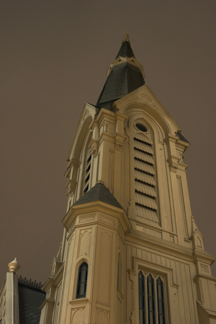
| Very interesting lines and textures. It just seems that the building is tipping to the right. Need to make sure that in Architectual photographs, the there is a sturdy base to stand on and that you are completely level with the building lines. I know that this is perception of the front tower on the bottom middle of the picture that is pushing this building back, but just something to keep in mind. I do like your background complimentary color too. Don't worry, I still gave you a good vote! |
|
| Photographer found comment helpful. |
|
|
04/14/2007 02:35:38 PM |
| very nice detail on the church - I believe you also used a slight sepia tone which is nice. |
|
| Photographer found comment helpful. |
|
|
04/13/2007 02:42:09 AM |
|
| Photographer found comment helpful. |
|
|
04/12/2007 06:47:00 PM |
| would have been better IMO if it were a bit birghter. |
|
| Photographer found comment helpful. |
|
|
04/11/2007 08:08:56 PM |
| The building looks like it's tilting. |
|
| Photographer found comment helpful. |
|
|
04/11/2007 05:43:10 AM |
| Love the tones to this one. Well done. |
|
| Photographer found comment helpful. |
|
|
04/11/2007 02:59:37 AM |
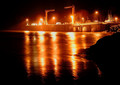
| cool shot. doesnt really present the element of night though. |
|
| Photographer found comment helpful. |
Home -
Challenges -
Community -
League -
Photos -
Cameras -
Lenses -
Learn -
Help -
Terms of Use -
Privacy -
Top ^
DPChallenge, and website content and design, Copyright © 2001-2025 Challenging Technologies, LLC.
All digital photo copyrights belong to the photographers and may not be used without permission.
Current Server Time: 03/11/2025 01:49:01 PM EDT.