| Author | Thread |
|
|
05/21/2007 06:16:06 PM |
| Very highly creative...and very well done! I love the originality and comp! It is a WOW! |
|
 Photographer found comment helpful. Photographer found comment helpful. |
|
|
05/20/2007 10:13:31 PM |
| I really like the concept here as it works so well..... |
|
| Photographer found comment helpful. |
|
|
05/02/2007 04:39:09 PM |
Hi from the Critique Club,
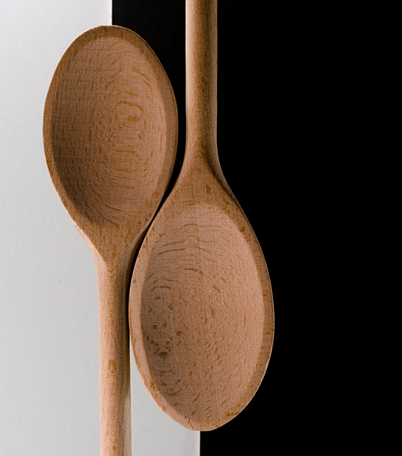
You've done a great job here of using kitchenware creatively. Though certainly not the most exciting of the kitchenware shots, you have conveyed a particular message, and that is extremely important in my opinion.
Technically, there are a few issues with this shot, but overall it is well done. The left spoon looks a bit crooked (needs to rotate clockwise a bit), but that is extremely minor (and I might be wrong; I'm simply eyeballing it). As I said in my original comment during the competition, the white is not white, and I believe it should have been. I see that you probably would have run into contrast issues with the left spoon handle had the white been white (since the handle is quite light), but I would call the area below the right spoon gray (not even off-white). The uneven spoon sizes distract a bit from the symmetry of the image, but it certainly doesn't make the image a bad one. Indeed, this is a great shot, and is every bit worthy of a top 30 finish.
Great detail in the spoons, with nothing out of focus. I like the right spoon--and especially the handle--with the browns balancing against the black nicely.
Very nicely done, and congratulations on a new personal best.
Regards,
Geoff Ball |
|
| Photographer found comment helpful. |
Comments Made During the Challenge  |
|
|
04/29/2007 10:36:42 PM |
| I love the comanding simplicity of this still life. Evidence that sometimes less is best. Well done. |
|
| Photographer found comment helpful. |
|
|
04/29/2007 02:11:39 PM |
| Great idea, great colours, great lighting. |
|
| Photographer found comment helpful. |
|
|
04/29/2007 07:07:30 AM |
|
| Photographer found comment helpful. |
|
|
04/28/2007 01:56:04 AM |
| Very nice take on a classic design. |
|
| Photographer found comment helpful. |
|
|
04/26/2007 10:26:49 PM |
| Good concept and nice lighting, but I'd have gone for perfect symmetry, with same size spoons and same amount of space on either side. |
|
| Photographer found comment helpful. |
|
|
04/25/2007 01:09:33 PM |
| Nice composition, but the tones are a bit flat. |
|
| Photographer found comment helpful. |
|
|
04/25/2007 12:11:32 PM |
| Very simple and elegant. Nice. |
|
| Photographer found comment helpful. |
|
|
04/24/2007 09:15:09 PM |
| The detail of the spoons is great. I think usually equal space is given for white and black but then again, having the spoons dead center may not have been that appealing either. |
|
| Photographer found comment helpful. |
|
|
04/24/2007 01:54:41 PM |
| So clean and simple, and yet so very original: the beech wood textures/palette perfectly set off the Zen fell of the image and title. Lovely. I like the vertical composition too...hmm just very clever the way the spoons lock into each other, echoing the original Yin and Yang symbol. |
|
| Photographer found comment helpful. |
|
|
04/24/2007 01:30:08 PM |
| Good detail, but the white isn't very white (it's too gray in the bottom-left). |
|
| Photographer found comment helpful. |
|
|
04/23/2007 06:55:50 AM |
|
| Photographer found comment helpful. |
|
|
04/23/2007 12:08:02 AM |
|
| Photographer found comment helpful. |
Home -
Challenges -
Community -
League -
Photos -
Cameras -
Lenses -
Learn -
Help -
Terms of Use -
Privacy -
Top ^
DPChallenge, and website content and design, Copyright © 2001-2025 Challenging Technologies, LLC.
All digital photo copyrights belong to the photographers and may not be used without permission.
Current Server Time: 03/13/2025 02:24:39 AM EDT.