| Author | Thread |
Comments Made During the Challenge  |
|
|
04/23/2007 02:15:20 PM |
|
|
|
04/20/2007 11:51:21 PM |
| Very laid back evocative composition. |
|
|
|
04/20/2007 01:13:46 AM |
| This is such an interesting image that you have presented here. I love the tones and the overall color cast. Great photograph. |
|
 Photographer found comment helpful. Photographer found comment helpful. |
|
|
04/19/2007 10:36:00 PM |
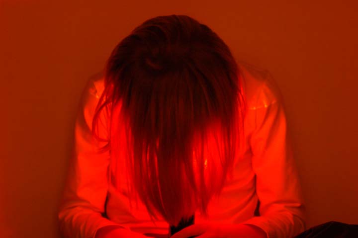
| Great processing!! I like the red color! My taste is a little different than the usual person! It could ahve used a little more clarity, but that is hard for me to obtain on some of my really processed pics, good job! 6 |
|
| Photographer found comment helpful. |
|
|
04/19/2007 12:06:35 PM |
|
|
|
04/18/2007 08:58:26 PM |
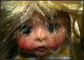
| Reminds me of the "Grudge" (movie)... says hair |
|
|
|
04/18/2007 12:30:39 PM |
This looks like it would be really cool! I'm guessing that you are holding a flashlight with your hair over it? Well, here is my two cents. :)
First of all, it's out of focus. If you can fix that, and get a focused image, it will get you a much better photo, and thus a much better score with the voters! Secondly, all the red tones are really cool, but there's almost a little bit too much of it. Taking the saturation down a tiny bit might help with that.
I like the centered composition you used - usually I try to avoid centered compositions - but in my opinion, it worked well here! This is a cool idea for the challenge, it just needs a little technical work. Keep shooting! :) |
|
| Photographer found comment helpful. |
|
|
04/18/2007 11:30:46 AM |
| IMHO I don't like the red, seems out of focus and poorly composed. |
|
|
|
04/18/2007 10:46:49 AM |
| i like the idea, but i think this wouldhave been a much stronger image if it was a square crop. then the blurring would appear more intentional, and you'd be less likely to be marked down for it. |
|
| Photographer found comment helpful. |
Home -
Challenges -
Community -
League -
Photos -
Cameras -
Lenses -
Learn -
Help -
Terms of Use -
Privacy -
Top ^
DPChallenge, and website content and design, Copyright © 2001-2025 Challenging Technologies, LLC.
All digital photo copyrights belong to the photographers and may not be used without permission.
Current Server Time: 04/26/2025 08:55:58 AM EDT.