| Author | Thread |
|
|
05/05/2007 01:05:13 AM |
Greetings from the CC club!
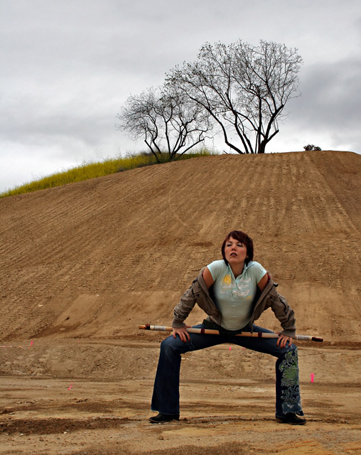
I planned to comment on this shot either way, so I'm so glad I got this one to critique! :)
I loved the series you did and this was one of your stronger choices. The problem as I see it with this image is that there are two very distinct subjects; the woman and the trees on the hilltop. The eye gets lost. The solution would have been to draw the interest strongly to one or the other, but not both (I would have chosen the woman). Remember, the eye automatically looks for the brightest point in an image and use that. In this case brightening her and darkening the sky would have been enough to shift the balance. Fill flash or post processing would both achieve that, but flash would have been best.
This shot was so ALMOST great. With a little more attention to light you'll have epic shots. Great of your friends to play along! :D
Cindi |
|
 Photographer found comment helpful. Photographer found comment helpful. |
Comments Made During the Challenge  |
|
|
04/30/2007 06:45:58 AM |
|
| Photographer found comment helpful. |
|
|
04/30/2007 06:40:10 AM |
| Somehow I think this shot would have had a bigger impact on me had her pose/stance either been a bit more agressive or "zen", it´s somewhere in between and doesn´t seem to me to be very well thought out. Also having her directly under the tree is maybe not the best choice, had you taken a couple of steps to either side and had her in a lower corner and the tree in the opposite upper corner I think the composition would have been much more balanced. Good shot anyway and above average in the challenge, gave a 6. |
|
| Photographer found comment helpful. |
|
|
04/29/2007 05:06:23 PM |
| I'm voting this high and no, I don't know who did it. I like the stance, the pool cue, the trees - the whole thing. It's different and kinda artsy. 8 |
|
| Photographer found comment helpful. |
|
|
04/28/2007 11:30:52 AM |
What is she doing? did sombody steal the chair?
I quite like the image, but the pose really doesn't do anything except make me question why. |
|
| Photographer found comment helpful. |
|
|
04/28/2007 10:36:59 AM |
| Good theme compliance. I'm wondering what the stick is. The pink markers are distracting. |
|
| Photographer found comment helpful. |
|
|
04/27/2007 04:57:18 PM |
I like composition..
Looks great.. |
|
| Photographer found comment helpful. |
|
|
04/27/2007 08:22:07 AM |
| The placement of the fluorescent stakes is not favorable. |
|
| Photographer found comment helpful. |
|
|
04/26/2007 10:22:08 PM |
| All the bright pink slash marks are so distracting to me. |
|
| Photographer found comment helpful. |
|
|
04/26/2007 04:41:18 PM |
| has the 1/3's really covered....8 |
|
| Photographer found comment helpful. |
|
|
04/25/2007 07:36:10 AM |
| Nice picture. But why didn't you remove the pink dots?! |
|
| Photographer found comment helpful. |
|
|
04/25/2007 12:32:45 AM |
| the girl and the tree are competing with each other... |
|
| Photographer found comment helpful. |
Home -
Challenges -
Community -
League -
Photos -
Cameras -
Lenses -
Learn -
Help -
Terms of Use -
Privacy -
Top ^
DPChallenge, and website content and design, Copyright © 2001-2025 Challenging Technologies, LLC.
All digital photo copyrights belong to the photographers and may not be used without permission.
Current Server Time: 03/10/2025 06:10:00 PM EDT.