| Author | Thread |
|
|
06/24/2007 01:15:58 AM |
| I like the colortones and graphic deel to this one. Well set out and it just please me..... |
|
 Photographer found comment helpful. Photographer found comment helpful. |
Comments Made During the Challenge  |
|
|
05/03/2007 06:16:42 PM |
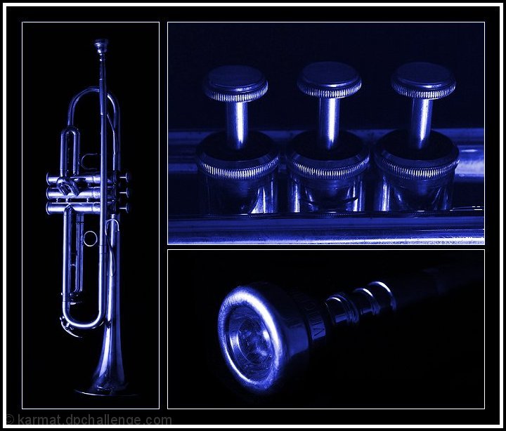
| Nice layout and subject but the top panel has a blue tint in the black areas unlike the other two panels. A little distracting. Other than that a good shot. |
|
| Photographer found comment helpful. |
|
|
05/02/2007 02:42:49 AM |
| Great set - love the light and blue tones. Very nice. |
|
| Photographer found comment helpful. |
|
|
04/30/2007 08:22:27 PM |
|
| Photographer found comment helpful. |
|
|
04/30/2007 08:14:42 PM |
| Class. The black looks murky in the top-right image though. Strong arrangement. |
|
| Photographer found comment helpful. |
|
|
04/30/2007 04:57:23 PM |
| nice images and nice details shots. the blue doesnt do it for me, but seems to achieve what it sets out to do. 7 |
|
| Photographer found comment helpful. |
|
|
04/30/2007 12:18:00 PM |
| Nice composition. Only negative comment would be the background color in the top right section doesn't match the other two which makes it somewhat distracting. Other than that....very nice. |
|
| Photographer found comment helpful. |
|
|
04/30/2007 12:12:51 PM |
Perhaps a little dark, but I like the subject and the blue treatment.
Nice triptych. |
|
| Photographer found comment helpful. |
|
|
04/30/2007 11:23:14 AM |
| I like the blue hues here! Great shots *7* |
|
| Photographer found comment helpful. |
Home -
Challenges -
Community -
League -
Photos -
Cameras -
Lenses -
Learn -
Help -
Terms of Use -
Privacy -
Top ^
DPChallenge, and website content and design, Copyright © 2001-2025 Challenging Technologies, LLC.
All digital photo copyrights belong to the photographers and may not be used without permission.
Current Server Time: 03/12/2025 03:54:39 PM EDT.