| Author | Thread |
Comments Made During the Challenge  |
|
|
05/02/2007 09:05:35 AM |
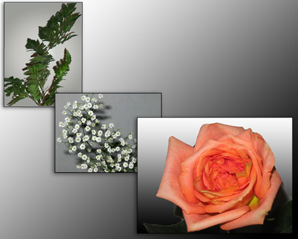
| very nice layout and use of negative space -- leads the eye right to the main subject. The picture on the top left is weak, though, and drags down the overall image a bit. |
|
 Photographer found comment helpful. Photographer found comment helpful. |
|
|
05/01/2007 08:43:13 PM |
| Like the grey but the images look a little too stark and over flashed plus the fern has been rotated and looks odd. |
|
| Photographer found comment helpful. |
|
|
04/30/2007 09:12:02 PM |
| A very nice and delicate presentation. |
|
| Photographer found comment helpful. |
|
|
04/30/2007 08:15:42 PM |
|
| Photographer found comment helpful. |
|
|
04/30/2007 10:18:20 AM |
| Good presentation for a wedding... love it... |
|
| Photographer found comment helpful. |
Home -
Challenges -
Community -
League -
Photos -
Cameras -
Lenses -
Learn -
Help -
Terms of Use -
Privacy -
Top ^
DPChallenge, and website content and design, Copyright © 2001-2025 Challenging Technologies, LLC.
All digital photo copyrights belong to the photographers and may not be used without permission.
Current Server Time: 03/14/2025 09:36:08 AM EDT.