| Author | Thread |
|
|
05/07/2007 07:21:10 AM |
Hello from the Critique Club,
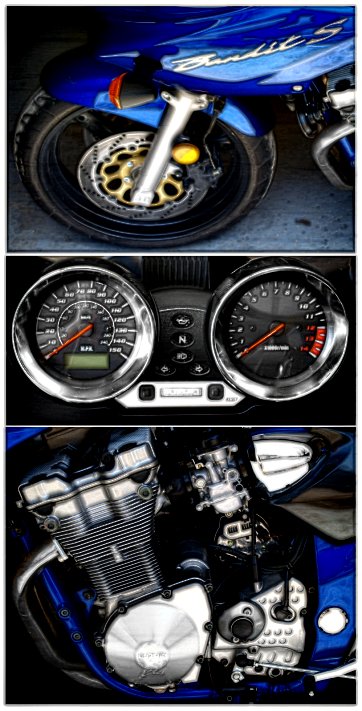
I didn't vote in this challenge so this is the first look I've had at your image. My first impression is that I like the balance of the three images, as the center image of the gages really help tie the top and bottom images together. However, the three images aren't really that sharp and the top one looks distorted somehow. Reading through the comments you received, many of the voters agreed.
Reading through your process steps I noticed that you intentionally added blur to this image. Was this part of a post processing style you were trying to emulate or an attempt to soften the sharpening artifacts on the engine image?
When I first upgraded my photo editing software to Paint Shop Pro I spent a whole month reprocessing my old images to learn the program. It was the best 30 days away from my camera ever spent. I think you have three very nice images for practicing your post processing skills. I love the composition of these three and hope you will take some time working on them.
Feel free to PM me if you have any questions regarding this critique.
Tim
|
|
 Photographer found comment helpful. Photographer found comment helpful. |
Comments Made During the Challenge  |
|
|
05/05/2007 05:08:07 PM |
| just a little sharper and this would be great |
|
| Photographer found comment helpful. |
|
|
05/03/2007 04:56:10 PM |
|
| Photographer found comment helpful. |
|
|
05/03/2007 03:12:33 PM |
| Nice idea but IMO the PP is a little strange |
|
| Photographer found comment helpful. |
|
|
05/02/2007 11:05:05 AM |
| Great set - Like the images alot - I think the PP is just a tad over done as you don't know if the pics are out of focus or not. |
|
| Photographer found comment helpful. |
|
|
05/02/2007 08:53:42 AM |
| Too much editing effects. |
|
| Photographer found comment helpful. |
|
|
04/30/2007 09:23:29 PM |
|
| Photographer found comment helpful. |
|
|
04/30/2007 04:35:11 PM |
| Nice to see a differnta layout, however the subject matter is rather boring (to me) and the top image looks slightly distorted. 6 |
|
| Photographer found comment helpful. |
|
|
04/30/2007 09:32:20 AM |
| I'm not sure what effect you put on these, but it's too heavy for my taste |
|
| Photographer found comment helpful. |
|
|
04/30/2007 12:51:12 AM |
| Veyr nice seems a lil blurry from resizing? |
|
| Photographer found comment helpful. |
Home -
Challenges -
Community -
League -
Photos -
Cameras -
Lenses -
Learn -
Help -
Terms of Use -
Privacy -
Top ^
DPChallenge, and website content and design, Copyright © 2001-2025 Challenging Technologies, LLC.
All digital photo copyrights belong to the photographers and may not be used without permission.
Current Server Time: 03/14/2025 01:12:23 PM EDT.