| Author | Thread |
|
|
05/07/2007 11:15:14 AM |
Greetings from the critique club!
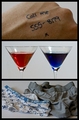
This image is well composed, I like the variety in the 3 images as each is quite different from the others. The image on the right, however shows very harsh light which I'm sure effected your score. Also, it looks like a sticker was left on the glasses in the image on the right which is distracting so close to her eye. Overall, I think you did a nice job, but a bit more care to details would have scored higher.
Hope that helps. Good luck with your future entries.
Cindi |
|
 Photographer found comment helpful. Photographer found comment helpful. |
Comments Made During the Challenge  |
|
|
05/05/2007 05:22:52 AM |
| Nice and unique - this has strong eye appeal. |
|
| Photographer found comment helpful. |
|
|
05/02/2007 11:34:18 AM |
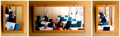
| Nice set - Find the highlights in the first pic a tad distracting. |
|
| Photographer found comment helpful. |
|
|
05/02/2007 10:49:57 AM |
| haha looks like a lenscrafters ad! :) |
|
| Photographer found comment helpful. |
|
|
04/30/2007 09:12:31 PM |
| Nice character portrayal. |
|
| Photographer found comment helpful. |
|
|
04/30/2007 03:46:30 AM |
| Lovely set of portraits, bottom left is the standout shot. Very nicely balanced |
|
| Photographer found comment helpful. |
Home -
Challenges -
Community -
League -
Photos -
Cameras -
Lenses -
Learn -
Help -
Terms of Use -
Privacy -
Top ^
DPChallenge, and website content and design, Copyright © 2001-2025 Challenging Technologies, LLC.
All digital photo copyrights belong to the photographers and may not be used without permission.
Current Server Time: 03/13/2025 02:21:59 AM EDT.