| Author | Thread |
|
|
05/10/2007 10:31:46 PM |
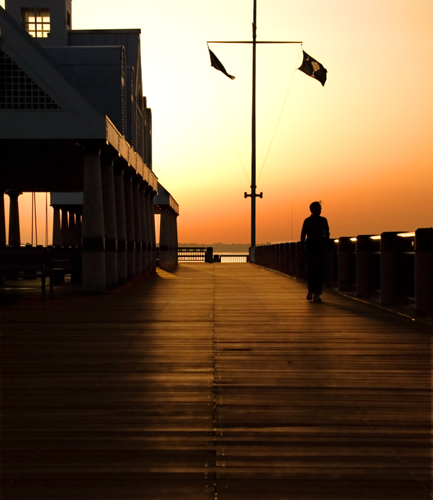
CRITIQUE CLUB CRITIQUE
by karmat
Lovely, relaxing tones.
Compositionally, you have effectively used leading lines to direct the eyes upwards and through the frame. I also like the balance created between the building on the left and the flags on the right. The person helps to add a human element to the story and that adds to the interest of the story.
Technically, I like that there are still some details in the silhouette, and the orange provides a nice contrast. I honestly can't think of anything I would suggest to change in this -- it is that awesome a shot.
We had been toying with the idea of going to Charleston this summer. This shot has about made me definitely decide to do so. :)
If I need to clarify or further explain myself, please let me know.
Karma |
|
 Photographer found comment helpful. Photographer found comment helpful. |
Comments Made During the Challenge  |
|
|
05/07/2007 11:09:06 PM |
| Fabulous composition & tone... |
|
| Photographer found comment helpful. |
|
|
05/07/2007 06:05:25 PM |
| We see a lot of orange profile shots on DPC, but this one has something special. It's hard to put my finger on it, but I think it may partly be that you haven't over-saturated it. Also I really like the balance of the composition. 10 |
|
| Photographer found comment helpful. |
|
|
05/06/2007 10:41:42 AM |
| A very relaxing image to look at. Subtle, simple and beautiful colours. |
|
| Photographer found comment helpful. |
|
|
05/01/2007 02:06:18 PM |
| Is the title a billy joel reference? Nice Shot. |
|
| Photographer found comment helpful. |
Home -
Challenges -
Community -
League -
Photos -
Cameras -
Lenses -
Learn -
Help -
Terms of Use -
Privacy -
Top ^
DPChallenge, and website content and design, Copyright © 2001-2025 Challenging Technologies, LLC.
All digital photo copyrights belong to the photographers and may not be used without permission.
Current Server Time: 03/12/2025 03:04:39 PM EDT.