| Author | Thread |
|
|
05/16/2007 03:13:39 PM |
Greetings from the Critique Club!
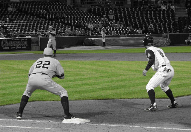
There's sort of a vintage feel here, since old baseball cards and such sometimes had a little wacky colorization in it, and the green and grey are a pleasant combination. The composition is not very interesting, though. Nothing much is happening and what is happening is out of frame. The third baseman is standing on the first baseman's head. A prominent position is given to the ball boy in the background, but he's not doing anything interesting, and his head disappears into the bleachers. |
|
Comments Made During the Challenge  |
|
|
05/15/2007 01:58:25 PM |
| interesting choice... can't decide if I like it. Very well executed, no doubt. gives it a very vintage feel. All right, after looking at it for a while, I've decided it was a good choice. Would be interested in seeing the edit in color though. |
|
|
|
05/13/2007 08:56:02 PM |
| i really don't like the choice of desaturation - it really looks odd in this photo because it highlights the background grass and not the runner or the fielders 4 |
|
|
|
05/12/2007 08:50:55 PM |
| Don't care for this use of selective desat. It seems to remove the excitement from the shot. (Maybe there was no excitement -- the stands are empty. :P) |
|
|
|
05/12/2007 03:29:03 AM |
| Good shot. How did you manage to get B&W with green grass using basic editing? |
|
|
|
05/11/2007 09:35:12 PM |
| In my opinion doesn't meet the Basic Editing requirements. I'll pass on the vote but I like the picture and concept. |
|
|
|
05/10/2007 08:07:12 PM |
| I'm not a fan of selective coloring. While I can see the intent here, it seems to really make the image worse. The color palette doesn't work well together. While the action is okay, I just find the image tough to look at. Title is clever though. |
|
|
|
05/09/2007 07:57:07 PM |
I have a feeling that this image does not comply to the basic rule set.
great comp, but why do I care? I don't. You are not giving me any reason to care for these players. To cheer for which ever player.
There faces are not seen so the emotional value is poor.
they are just standing there with there back side in my face, so the capture is poor, lighting flat, great texture, color nice, selective desat nice.
dof too sharp for sport photography. A shallow dof is almost a requirement in sports because it is about the player and not the fan and it most definetly is not about the advertisements. Over all a boring image.
Don't give up, just do better. |
|
|
|
05/09/2007 06:03:03 PM |
| The selective desat is nice. |
|
|
|
05/09/2007 03:32:52 PM |
| I just can't see the point here. Sorry, but the desaturation doesn't do anything for me. |
|
|
|
05/09/2007 03:23:43 PM |
| is this pre-game? the seats are empty! |
|
|
|
05/09/2007 07:36:18 AM |
| I don't get the point of the partial desaturation because it draws focus onto the grass instead of onto the players. I'd prefer if I can see the faces and emotions of the players. |
|
Home -
Challenges -
Community -
League -
Photos -
Cameras -
Lenses -
Learn -
Help -
Terms of Use -
Privacy -
Top ^
DPChallenge, and website content and design, Copyright © 2001-2025 Challenging Technologies, LLC.
All digital photo copyrights belong to the photographers and may not be used without permission.
Current Server Time: 03/13/2025 02:20:50 AM EDT.