| Author | Thread |
|
|
06/26/2007 06:03:37 PM |
| HAHAHA I loved this, Gave it an 8 and hey look you are part of the top 100 so that's a good thing. I would say that the border messed you up here. It's a tad too busy IMO. |
|
 Photographer found comment helpful. Photographer found comment helpful. |
Comments Made During the Challenge  |
|
|
05/19/2007 07:49:02 PM |
| I absolutely love this. It's just so random and funny. |
|
| Photographer found comment helpful. |
|
|
05/18/2007 11:04:59 AM |
|
| Photographer found comment helpful. |
|
|
05/16/2007 07:20:01 PM |
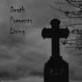
| Looks more like a postcard than an album colour. But I like the colours and textures. |
|
| Photographer found comment helpful. |
|
|
05/16/2007 03:15:20 PM |
| Too funny! And cute, kinda. Nicely composed. |
|
| Photographer found comment helpful. |
|
|
05/16/2007 09:32:05 AM |
| ha ha lovely, crop is a little tight, but neat idea, 7. |
|
| Photographer found comment helpful. |
|
|
05/15/2007 11:17:03 AM |
| very cute and fun shot, 8 |
|
| Photographer found comment helpful. |
|
|
05/15/2007 08:34:28 AM |
| where's your DPL?, Of course I don't know if it's mandatory that it be on there...(?) |
|
| Photographer found comment helpful. |
|
|
05/15/2007 12:29:56 AM |
| Hilarious. I would have employed the square crop to add a sharper competitative edge. Bump. |
|
| Photographer found comment helpful. |
|
|
05/14/2007 06:50:21 PM |
| How cool is this shot. Great title and capture and I do not care that it is not an album square crop. + 9 |
|
| Photographer found comment helpful. |
|
|
05/14/2007 11:35:13 AM |
| This actually made me laugh! |
|
| Photographer found comment helpful. |
|
|
05/14/2007 03:00:14 AM |
| Nice idea, good shot, but shouldn't be an album cover in square format? Would also have been better to include the bands name on the cover. The frame ditracts, too. |
|
| Photographer found comment helpful. |
|
|
05/14/2007 02:17:26 AM |
| Ha. Nice one. I would have left out the border if I were you. Looks fine but makes it look a little less like an album cover. |
|
| Photographer found comment helpful. |
|
|
05/14/2007 01:14:41 AM |
| Love the shot and the titles, but with the framimg, it looks more like a photo than an album cover. Would have been a bit more effective if the shot were more shaped like an album or CD cover...more square? But, just my opinion. |
|
| Photographer found comment helpful. |
Home -
Challenges -
Community -
League -
Photos -
Cameras -
Lenses -
Learn -
Help -
Terms of Use -
Privacy -
Top ^
DPChallenge, and website content and design, Copyright © 2001-2025 Challenging Technologies, LLC.
All digital photo copyrights belong to the photographers and may not be used without permission.
Current Server Time: 03/14/2025 09:28:22 AM EDT.