| Author | Thread |
|
|
05/23/2007 02:22:47 PM |
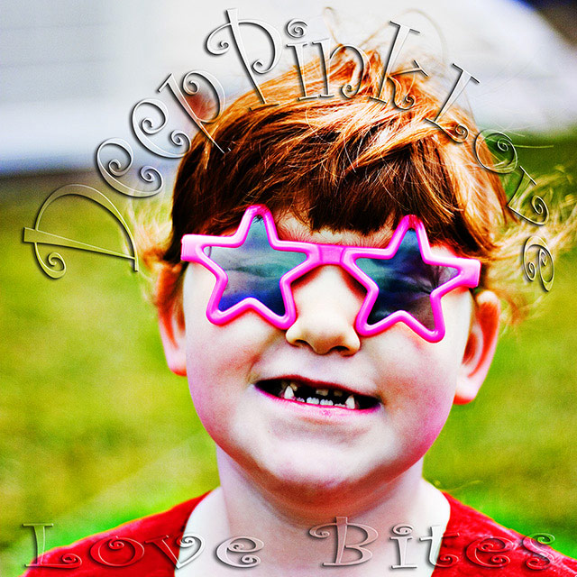
| This is a great shot, the over-sat works very well. Could be a real cover! |
|
 Photographer found comment helpful. Photographer found comment helpful. |
|
|
05/22/2007 02:32:49 PM |
| One of the best album covers in the bunch. You really got the feel of a band captured in this photo, in addition, it's hilarious. Clearly, your score sucks and it should have been much, much higher. |
|
| Photographer found comment helpful. |
|
|
05/22/2007 11:53:00 AM |
| I was one of your 8's - I think this is most creative and really looks like an album cover. Robbed for sure! |
|
| Photographer found comment helpful. |
|
|
05/21/2007 01:20:59 PM |
| All I am going to say is underrated. This is the epitome of a modern album cover. |
|
| Photographer found comment helpful. |
|
|
05/21/2007 06:31:54 AM |
| very creative and full of energy - scores around here lately just suck, this deserved better |
|
| Photographer found comment helpful. |
|
|
05/21/2007 05:29:30 AM |
| I really don't understand why this did not go better - it was excellent - over the top and hilarious! |
|
| Photographer found comment helpful. |
|
|
05/21/2007 01:21:17 AM |
Hey there from the Critique Club
I'll echo some of what your previous commenters have already said. This one is so nice because it is so over the top. I agree that the over-saturation and the boldness of this capture would make it a perfect album cover. I like your depth of filed, as well as the grain you created with the over saturation. Nice work, and I agree that you were robbed on this one. This would absolutely make a terrific album cover!
Thank you for the opportunity to provide a critique on your entry,
Eric
|
|
| Photographer found comment helpful. |
|
|
05/21/2007 12:55:35 AM |
Youse wuz robbed ;)
This was just so bizarre and over-the-top that it BEGS to be on a real album. I love it!
Lol, just looked through and found posthumous leaving pretty much the comment I expected :D |
|
| Photographer found comment helpful. |
Comments Made During the Challenge  |
|
|
05/20/2007 02:24:41 PM |
| Like this one ... the deep saturated colors and goofy image give this a strong 80s feel. 7 |
|
| Photographer found comment helpful. |
|
|
05/18/2007 12:55:20 PM |
|
| Photographer found comment helpful. |
|
|
05/17/2007 11:17:53 PM |
| How can you go wrong with Deee-Lite glasses? the colors in this are just perfect. I could easily imagine this in an indie record store, if such things still exist. Unfortunately I know you're a teammate so I will refrain from voting. This would have gotten a big score from me. (I guess this is xianart) |
|
| Photographer found comment helpful. |
|
|
05/16/2007 07:15:12 PM |
| Good for an album cover. Really jumps out at you and grabs your attention. I like the way you did the text too. |
|
| Photographer found comment helpful. |
|
|
05/16/2007 03:33:23 PM |
| Heh! It does indeed look like something you'd see on an album cover. |
|
| Photographer found comment helpful. |
|
|
05/15/2007 12:05:19 PM |
| Geeee, Elton John was a funny looking kid ;-) |
|
| Photographer found comment helpful. |
|
|
05/15/2007 11:02:20 AM |
|
| Photographer found comment helpful. |
|
|
05/15/2007 09:21:38 AM |
| i really like this! I could see this cover really in the stores |
|
| Photographer found comment helpful. |
|
|
05/15/2007 04:40:22 AM |
|
| Photographer found comment helpful. |
|
|
05/14/2007 10:28:38 AM |
|
| Photographer found comment helpful. |
|
|
05/14/2007 12:36:40 AM |
| oh my....um, interesting! lol |
|
| Photographer found comment helpful. |
Home -
Challenges -
Community -
League -
Photos -
Cameras -
Lenses -
Learn -
Help -
Terms of Use -
Privacy -
Top ^
DPChallenge, and website content and design, Copyright © 2001-2025 Challenging Technologies, LLC.
All digital photo copyrights belong to the photographers and may not be used without permission.
Current Server Time: 03/12/2025 07:49:51 AM EDT.