| Author | Thread |
Comments Made During the Challenge  |
|
|
05/20/2007 02:22:22 PM |
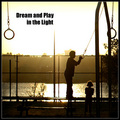
B&W works very well for this, and there are some nice textures in the picture. However, the centred composition is a bit dull, and the POV is unimaginative. And is the picture intentionally tilted clockwise?
Quite a nice shot, but I think the same idea could have been done more imaginatively. 6 |
|
 Photographer found comment helpful. Photographer found comment helpful. |
|
|
05/20/2007 09:47:55 AM |
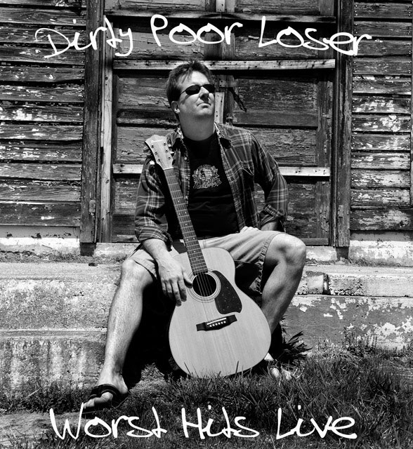
| He doesn't look a lot like a "poor loser", which is a shame since the photo is really good. Nice lettering. |
|
| Photographer found comment helpful. |
|
|
05/18/2007 08:29:47 PM |
| Great shot. Black and white works well here. |
|
| Photographer found comment helpful. |
|
|
05/16/2007 03:58:51 PM |
| For fans of Jack Johnson, haha |
|
| Photographer found comment helpful. |
|
|
05/16/2007 06:30:06 AM |
| Love the title, like the font, but he doesn't look too terribly dirty or poor. :-) Good concept! |
|
| Photographer found comment helpful. |
|
|
05/15/2007 07:40:05 PM |
|
| Photographer found comment helpful. |
|
|
05/15/2007 10:57:38 AM |
| love the 'worst hits' part! 8 |
|
| Photographer found comment helpful. |
|
|
05/14/2007 09:14:26 AM |
| Another great title, love this, great work! 9 |
|
| Photographer found comment helpful. |
Home -
Challenges -
Community -
League -
Photos -
Cameras -
Lenses -
Learn -
Help -
Terms of Use -
Privacy -
Top ^
DPChallenge, and website content and design, Copyright © 2001-2025 Challenging Technologies, LLC.
All digital photo copyrights belong to the photographers and may not be used without permission.
Current Server Time: 04/25/2025 04:40:47 PM EDT.