| Author | Thread |
|
|
01/14/2004 03:59:10 PM |
Originally posted by Frankie_Lv:
.......The shadows in the picture just do not match the lighting. No matter how you use the light (angles/strenght) or even fill flash the shadows just do not match. There has been a lot more image editing and enhancing here then the photographer states and it is all bad. I could go on here and type for another hour but it would prove useless. The photographer of this photograph knows what was done and clearly understated it in there comment box. How this got the score it did is beyond me. I would have to rate it a 1 or 2 |
No there was not any more imaging editing than what is stated. As for the shadows, that is how they came out. I admit I went to far on the color adjustment, too much red adjustment.
Here is the original shot, resized only:

Deannda
Thanks for your critique |
|
|
|
01/02/2004 01:18:56 AM |
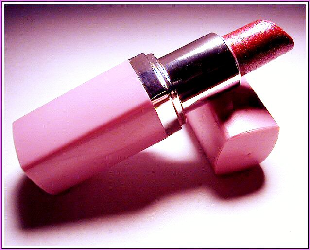
| Well I didn't like this photo when I looked at it this morning. Didn't like it when I looked at it this afternoon, and don't like it now. I am sorry but this is a bad photograph made worse by the attempt to fix it in photoshop or some other imaging software.The compositiion of the photo is ok but it's down hill from there. Though it fits (bearly) into the challenge the first thing that comes to mind when you look at this photo is commercial not macro. The lighting is way to strong here a much softer tone is needed. The photo is over exposed by at least 1 to 1 1/2 stops. The top of the lipstick container is washed out as is the top front of the cap. The shadows in the picture just do not match the lighting. No matter how you use the light (angles/strenght) or even fill flash the shadows just do not match. There has been a lot more image editing and enhancing here then the photographer states and it is all bad. I could go on here and type for another hour but it would prove useless. The photographer of this photograph knows what was done and clearly understated it in there comment box. How this got the score it did is beyond me. I would have to rate it a 1 or 2 |
|
 Photographer found comment helpful. Photographer found comment helpful. |
Comments Made During the Challenge  |
|
|
12/27/2003 10:05:19 PM |
| I suspect you over sharpened the hell out of this. and I should say it works. Very sensual and phallic photo, despite the obvious feminine subject. great shot. |
|
| Photographer found comment helpful. |
|
|
12/27/2003 12:45:24 PM |
| Nice composition. A bit more contrasting background may have stood this out more. Feel like I am in the back of a Mary Kay car. A touch less harsh lighting on this would make it softer and more sensual as if a product shot to sell this |
|
| Photographer found comment helpful. |
|
|
12/24/2003 05:53:31 AM |
| This looks like an advertising shot; for the case though, not the lipstick. I actually think it's pretty nicely done, with interesting lighting and composition, lovely color, and a border that doesn't distract or detract from the shot. |
|
| Photographer found comment helpful. |
|
|
12/23/2003 02:04:25 PM |
| Very nice shot of an everyday item! |
|
| Photographer found comment helpful. |
|
|
12/23/2003 10:43:47 AM |
Technical: fits the challenge. Exposure composition focus lighting excellent.
Personal: The only thing I would say is that the lipstick itself doesn't look smooth, like you'd expect lipstick to look in a shot like this. I think that may have to do with the lighting choice, but can't be sure.
My vote: 8 |
|
| Photographer found comment helpful. |
|
|
12/23/2003 10:40:10 AM |
| The image is very noisy and therefore contains some false colors. And one can see the structure of the cardboard used, which makes it a bit less smooth. But I like the simple composition, the overall color combinations with lipsticks and background. Good one. |
|
| Photographer found comment helpful. |
|
|
12/22/2003 02:35:02 PM |
| There is a strange lined effect in the background that I am not sure that I am keen on. The lighting also does not bring out the detail (which if that was your intention that I am sorry) which I think is a bitter shame. Nice composition. Good luck. |
|
| Photographer found comment helpful. |
|
|
12/22/2003 08:52:16 AM |
| Looks like my favorite shade! I like the soft shadow - nice job. |
|
| Photographer found comment helpful. |
|
|
12/22/2003 08:33:29 AM |
|
| Photographer found comment helpful. |
|
|
12/22/2003 12:16:09 AM |
| Beautiful shot, The lighting is great, the colors are very suitable to each other, the pink background brings out the detail in the lipstick, vey nice....9 |
|
| Photographer found comment helpful. |
Home -
Challenges -
Community -
League -
Photos -
Cameras -
Lenses -
Learn -
Help -
Terms of Use -
Privacy -
Top ^
DPChallenge, and website content and design, Copyright © 2001-2025 Challenging Technologies, LLC.
All digital photo copyrights belong to the photographers and may not be used without permission.
Current Server Time: 03/15/2025 03:01:39 AM EDT.