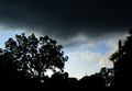
Susan, I think you've found an interesting angle, but I keep wanting more contrast. The tones seem all down in the dark end. Also, I agree with dr rick about the angle - I wonder whether there's some way to keep the fence out of the picture?
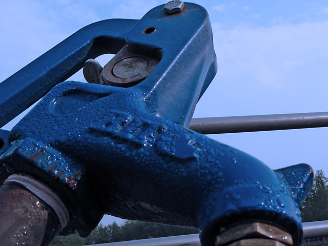
Finally, what's a "frost hydrant"? A well that keeps running in winter?
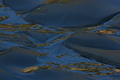
This photo really isn't about the water droplets. Which is good, because the droplets themselves aren't very interesting (nor really emphasized here). But not so good because it makes the connection to the challenge a bit tenuous; it doesn't jump out and say "Water!".
The hydrant is the real subject here, and the water droplets do add an interesting texture. The unusual point of view is creative, and I think it would work well if it wasn't so crowded at the top. There are a lot of diagonal lines here, which make the photo very dynamic. The bolt at the very top is a natural anchor here, and a lot of lines lead to it (like the handle). But it needs some space so the viewer's eye isn't pushed next to the edge. (If you did want a photo of the water droplets, you'd need to crop out that bolt; it draws the eye away from the droplets.)
The sky seems a bit bland here. I don't know if that's because the cooling filter makes the clouds disappear, or because the sky just isn't exciting at this time. A polarizer might have helped darken the sky and increase the contrast with the clouds. Or just a different time with better lighting would have made a more interesting photo.
I don't particularly like the way the fence "sticks out" of the hydrant. Removing it is probably too hard, but perhaps moving the camera just a bit would have improved its interaction with the hydrant. Hard to say without being there. (But the low viewpoint is definitely interesting here, so try to keep that!)
Finally, I have to agree with purpleflutterby13 that use of the cooling filter looks like an unintentional color cast here. While that filter can be useful, use of any filter needs to be subtle for best effect.
The use of the cooling filter is a bit too obvious - the picture just looks like your white balance setting was off by miles. However, selectively applying it might have worked quite well, as I think it does work on certain parts of the image. You can see sharpening traces on the railing, that could've been fixed too.
Otherwise pretty nice - interesting composition, it looks like the hydrant is running forwards :)