| Author | Thread |
Comments Made During the Challenge  |
|
|
01/04/2004 11:48:03 PM |
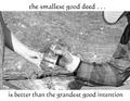
| I love the classic black/red/white design elements......... reminds me of a liturgical page. |
|
 Photographer found comment helpful. Photographer found comment helpful. |
|
|
01/04/2004 03:32:47 PM |
| Fabulous photo, choice of borders and colors works for me; don't particularly care for the typography at the top - I'm not sure if it's the font choice, or the bullets that separate the lettering, but I'm not crazy about that part. The look on that child's face is adorable! |
|
| Photographer found comment helpful. |
|
|
01/03/2004 04:17:24 PM |
| One of my favorite quotes (would like to see the attribution) Nice composition and black/white/red color selection. Light on the back of man's head draws too much attention -- makes him look "cut out and pasted on" Like the triple boarder. |
|
| Photographer found comment helpful. |
|
|
01/03/2004 03:35:40 AM |
| The halo's are off, they need touch up work. If this is a litteral profile, it's off with the baby. Throws off the symmetry. |
|
| Photographer found comment helpful. |
|
|
01/01/2004 01:32:40 PM |
Great idea. Lettering at the bottom is too small
|
|
| Photographer found comment helpful. |
|
|
01/01/2004 01:26:29 PM |
| I like the picture as it is , the border and the color of the text spoil the overall effect ... I would love to see this image with black text and a simple black frame . Maybe the the lighting of the persons head from the back was not a good idea ...just the lighting from the front would suffice ? |
|
| Photographer found comment helpful. |
|
|
01/01/2004 12:09:38 PM |
| I love the message. I'm not thrilled with the color of the text or the border. With the Dec rules in place, I would have cloned out the far collar, its a little distracting. And, I think you could have removed a bit more of the white around the fathers hairline to make it look less pasted into the black background. |
|
| Photographer found comment helpful. |
|
|
12/30/2003 09:17:38 PM |
| I like this alot- the self imposed white shadow looks a bit rough. I love that phrase and man thats a cute little baby. |
|
| Photographer found comment helpful. |
|
|
12/30/2003 03:12:02 PM |
| Nice shot. I think the rim lighting could be toned down a bit, but that's being picky. |
|
| Photographer found comment helpful. |
|
|
12/29/2003 10:50:38 PM |
| Great photo, very inspiring. 9 |
|
| Photographer found comment helpful. |
|
|
12/29/2003 01:48:56 PM |
| Tha baby looks really freaked out! I'm sorry, it just distracts from everything else. It also looks like a cut and paste job of the portrait onto the background, resulting in a very artificial image. For a motivational poster, this has too much text. |
|
| Photographer found comment helpful. |
|
|
12/29/2003 08:47:24 AM |
| Excellent quote, interesting image - a little soft on focus. Both the adult and child look so serious. I personally would like to see this with a little more "playful" image. |
|
| Photographer found comment helpful. |
|
|
12/29/2003 08:06:00 AM |
| The message is very motivational! The edge around the guy's back and head looks very cut and paste. The border could have done without the thick white part. |
|
| Photographer found comment helpful. |
|
|
12/29/2003 06:10:02 AM |
| The message of this poster is really beautiful. But here are my suggestions: when you edit background out of an image, make sure you adjust the remaining portions to the new background. The head of the man needs a contrast adjustment to make it appear more natural. Also the baby (IMO the main subject of this shot) should be more in focus. I understand you tried hard to make it appear as a pro poster, but IMO too many borders are simply too many - simplify. |
|
| Photographer found comment helpful. |
Home -
Challenges -
Community -
League -
Photos -
Cameras -
Lenses -
Learn -
Help -
Terms of Use -
Privacy -
Top ^
DPChallenge, and website content and design, Copyright © 2001-2025 Challenging Technologies, LLC.
All digital photo copyrights belong to the photographers and may not be used without permission.
Current Server Time: 03/12/2025 10:07:34 PM EDT.