| Author | Thread |
|
|
01/09/2004 10:06:18 PM |
Originally posted by mgrundy:
Critique Club Comment
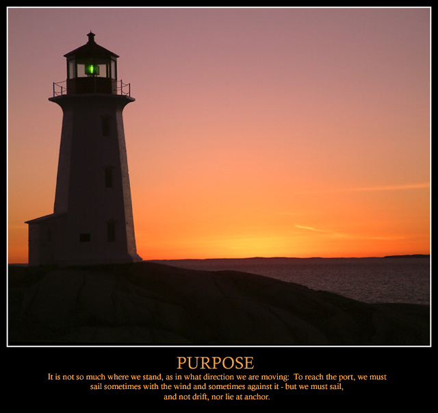
I must say to start that this is a stunning image. The colours are magnificent and you have still managed to capture detail in the lighthouse and the rocks in the foreground rather then end up with a silhouette against the sunlit sky.
The square(ish) format suits the picture along with the white frame around it and the verse and picture go well together. I only have one problem - the horizon really spoils what could be a perfect picture. Given the December rule set and assuming the picture couldn't be taken again, a quick minor adjustment in PS could have done the trick...
 |
It did the trick, but thanks anyway. Corrected crooked horizon and reframed with larger borders and text on two lines instead of three.
 NOW available as a print! NOW available as a print!
Message edited by author 2004-01-12 18:12:31. |
|
|
|
01/09/2004 01:17:23 AM |
I voted this a 9 and I am pleased for you that you achieved two ambitions
I have yet to crack the 7 even though I have achieved 4th
It's a beautiful photo and I guess the only reason it didnt win a ribbon is because there were a lot of amazing posters
Good luck to you in 2004 |
|
 Photographer found comment helpful. Photographer found comment helpful. |
|
|
01/08/2004 05:54:48 PM |
Critique Club Comment
I must say to start that this is a stunning image. The colours are magnificent and you have still managed to capture detail in the lighthouse and the rocks in the foreground rather then end up with a silhouette against the sunlit sky.
The square(ish) format suits the picture along with the white frame around it and the verse and picture go well together. I only have one problem - the horizon really spoils what could be a perfect picture. Given the December rule set and assuming the picture couldn't be taken again, a quick minor adjustment in PS could have done the trick...
|
|
| Photographer found comment helpful. |
|
|
01/05/2004 10:29:33 AM |
Thanks for the vote folks.
Well, I must say I'm pretty happy with results. I attained two of the goals I had set out for myself on DPC in 2004:
1) I finally got a top-10 finish
2) I got one of my submissions to crack the magical 7.0 barrier.
The "cherry on top" would have been a ribbon.
Thanks for all the comments. I plan on re-doing this poster for a print available through DPCPrints.
EDIT: And oh yeah, I'll be straightening out that crooked horizon too. Always check that from now on. Live and learn
Message edited by author 2004-01-05 11:13:31. |
|
|
|
01/05/2004 09:04:59 AM |
| He bro, congrats on your first + 7 shot. Shoulda won a ribbon. Good work. |
|
| Photographer found comment helpful. |
Comments Made During the Challenge  |
|
|
01/04/2004 06:47:52 PM |
|
| Photographer found comment helpful. |
|
|
01/04/2004 03:09:24 PM |
| Very nice, one of my top rated. Do not like the white line around the photo, I think I would have chosen the same color as the font color, or very close. The white is somewhat distracting to me. I would also like to have seen the width of the black border be a bit wider. |
|
| Photographer found comment helpful. |
|
|
01/04/2004 01:49:32 PM |
Very well done.
Quickly on ething I do not like is the square format but that is minor. I think a horizontal or panorama shot would have been great. |
|
| Photographer found comment helpful. |
|
|
01/03/2004 04:48:43 PM |
| One of the top ones! Like the metaphor of the lighthouse, it compliments the quote and the title. Minor suggestion - the font/size of the font for the quote could be bigger/kept to two lines/type set differently. Something about it is a smidge off. 9 |
|
| Photographer found comment helpful. |
|
|
01/03/2004 02:59:05 AM |
| Good lighting, maybe ensure the horizon is a little more level. Just a slight uneveness |
|
| Photographer found comment helpful. |
|
|
01/02/2004 08:56:56 PM |
| The verse you chose was perfect. |
|
| Photographer found comment helpful. |
|
|
01/02/2004 08:50:14 PM |
| Beautiful photo. I like the lighthouse as a not-quite-silhouette, with the windows discernable. Good composition and poster layout. A sailboat would have fit the text better. |
|
| Photographer found comment helpful. |
|
|
01/01/2004 01:41:27 PM |
| Very good shot and the text goes well with it. Would love to be able capture a shot like this. A 10 . |
|
| Photographer found comment helpful. |
|
|
01/01/2004 10:15:09 AM |
| Beautiful capture, great color, layout, borders, etc. Nice selection of font placement, size, etc. Great quote ( You should have given credit for that to Oliver Wendell Holmes ). |
|
| Photographer found comment helpful. |
|
|
12/31/2003 11:10:09 AM |
| Absolutely beautiful and REAL. 7 |
|
| Photographer found comment helpful. |
|
|
12/31/2003 01:12:05 AM |
| Beautiful and a winner in my opinion well done |
|
| Photographer found comment helpful. |
|
|
12/30/2003 05:56:43 PM |
| Who is the autor of this?! |
|
|
|
12/30/2003 12:42:32 PM |
| It is not in which direction we are moving, but whether we straighten up our horizon. |
|
| Photographer found comment helpful. |
|
|
12/29/2003 11:22:30 PM |
| Beautiful colors, composition, very nice photo. |
|
| Photographer found comment helpful. |
|
|
12/29/2003 11:06:10 PM |
| Excellent work,well deservet 10 here ! |
|
| Photographer found comment helpful. |
|
|
12/29/2003 03:35:09 PM |
| The is a gorgeous picture. love the colors and the quote is great too. Very nice poster layout IMO. Great as a picture on it's own and great as a poster too. Good luck with the challenge!!! |
|
| Photographer found comment helpful. |
|
|
12/29/2003 02:04:13 PM |
| Bravo. Compliments to you. Text is a bit small. Maybe it needs quotes and the author? Still a dandy shot. |
|
| Photographer found comment helpful. |
|
|
12/29/2003 01:57:13 PM |
| For me, too much text, with a title that's too small. Nice composition, though I'd like to have seen more light on the lighthouse and a straighter horizon. Given the flexibility of the December rule set, I'd also have changed the color of the green beacon as it distracts a little. |
|
| Photographer found comment helpful. |
|
|
12/29/2003 08:24:52 AM |
| I personnaly find the image more fitting to something like "standing strong and guiding others", but I like your choice as well. |
|
| Photographer found comment helpful. |
|
|
12/29/2003 06:54:02 AM |
| Lovely! I like the sentiment and the shot that goes with it! |
|
| Photographer found comment helpful. |
|
|
12/29/2003 03:25:46 AM |
| Beautiful, simple, clean. Stands out from some of the more busier posters. Colours are very nice, lovely contrast. Border OK. The text (the main word) could have been a bit larger (but just a tiny bit). You've done great job with this. |
|
| Photographer found comment helpful. |
|
|
12/29/2003 12:33:03 AM |
| Beautiful photo and really good choice the way you've done the text and border. |
|
| Photographer found comment helpful. |
|
|
12/29/2003 12:12:25 AM |
This is a beautiful shot.. wish the horizon was level.. that woud make a great improvement :)
|
|
| Photographer found comment helpful. |
Home -
Challenges -
Community -
League -
Photos -
Cameras -
Lenses -
Learn -
Help -
Terms of Use -
Privacy -
Top ^
DPChallenge, and website content and design, Copyright © 2001-2025 Challenging Technologies, LLC.
All digital photo copyrights belong to the photographers and may not be used without permission.
Current Server Time: 03/12/2025 01:44:22 PM EDT.