| Author | Thread |
Comments Made During the Challenge  |
|
|
04/07/2002 08:27:00 PM |
| Compression on this photo is way too high. |
|
|
|
04/06/2002 07:49:00 PM |
| Great composition! What's the fuzziness though? |
|
|
|
04/06/2002 10:52:00 AM |
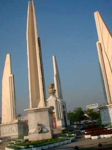
| composition would have been better from a lower perspective with the four towers converging at a point above. resolution is a bit poor |
|
|
|
04/05/2002 03:03:00 PM |
| neat, wish it was clearer. |
|
|
|
04/05/2002 01:42:00 AM |
|
|
|
04/03/2002 03:28:00 PM |
|
|
|
04/02/2002 10:45:00 PM |
|
|
|
04/02/2002 08:56:00 PM |
| this could have been a better picture if it weren't crooked. |
|
|
|
04/02/2002 07:07:00 PM |
| The subject seems interesting, but I think it would have bee incredible without the tilt. |
|
|
|
04/02/2002 05:16:00 PM |
| A seemingly grainy image, at a weird angle. I figure if you have multiple vertical items, the photo shouldn't be crooked. Just my opinion though. |
|
|
|
04/02/2002 04:07:00 PM |
| blurriness is distracting. |
|
|
|
04/02/2002 01:48:00 PM |
| either not very well focused or lost a lot of detail due to compression |
|
|
|
04/02/2002 08:06:00 AM |
| almost looks like something out of Star Wars Episode one. A bit on the blurry side. Was this shot from a moving car? |
|
|
|
04/02/2002 07:43:00 AM |
| Not sure about tye odd angle. |
|
|
|
04/01/2002 10:57:00 PM |
| a bit blurry and pixelated; I like the angle; great light; a bit of sky above the point of the highest, er, steeple would be good; |
|
|
|
04/01/2002 05:34:00 PM |
| Too much tilt and a little bit blurry, otherwise I like these "shapes". Is this a monument or something? |
|
|
|
04/01/2002 03:13:00 PM |
| The shot is blurry, and the color depth feels kinda flat; probably would have looked better if you were a little farther back to so you could get the right structure fully, and maybe to have a little bit of space around the edges. (Er.... what language is the title?) |
|
|
|
04/01/2002 12:30:00 PM |
| I am sure the tilt is ment to be but it detracts from this photo in my eye. Others of course will feel the tilt makes this shot. |
|
|
|
04/01/2002 12:20:00 PM |
|
|
|
04/01/2002 11:30:00 AM |
| Massive JPEG artifacs here - your compressed file is only 43Kb - unless you intended this result you need to take advantage of the maximum permissable file size of 150Kb - put a posting in Q & A forum if you are unsure how to do this. |
|
|
|
04/01/2002 10:34:00 AM |
| too much jpeg compression, interesting subject |
|
|
|
04/01/2002 07:46:00 AM |
| A good shot but WAY too much jpeg artifacting. your image is only 43k! next time, use more of the 150k we're allowed. |
|
|
|
04/01/2002 07:44:00 AM |
| interesting. too bad the picture is blurry. |
|
|
|
04/01/2002 02:05:00 AM |
| Almost, but the JPEG artifacting combined with everything being off-kilter makes it hard to look at. |
|
|
|
04/01/2002 01:36:00 AM |
| the focus is too soft, and I'd have tried to get a little more of the right, um... column into the picture. The picture looks really compressed on my screen, too. |
|
|
|
04/01/2002 12:50:00 AM |
| Sorry, but tilted pictures annoy me to no end! |
|
Home -
Challenges -
Community -
League -
Photos -
Cameras -
Lenses -
Learn -
Help -
Terms of Use -
Privacy -
Top ^
DPChallenge, and website content and design, Copyright © 2001-2025 Challenging Technologies, LLC.
All digital photo copyrights belong to the photographers and may not be used without permission.
Current Server Time: 03/12/2025 01:47:37 PM EDT.