| Author | Thread |
Comments Made During the Challenge  |
|
|
06/23/2007 11:00:41 PM |
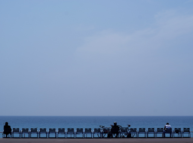
| Nice lines and I like the bold crop. |
|
 Photographer found comment helpful. Photographer found comment helpful. |
|
|
06/23/2007 10:53:57 AM |
| I like the negative space, and it would have been good for that challenge this week also. |
|
| Photographer found comment helpful. |
|
|
06/23/2007 12:23:31 AM |
|
| Photographer found comment helpful. |
|
|
06/21/2007 07:37:51 PM |
| Would have been good for negative space challenge. Little flat in lighting but not a bad capture. |
|
| Photographer found comment helpful. |
|
|
06/21/2007 05:03:52 PM |
| A little more contrast and this should ribbon. Great, great comp and capture. |
|
| Photographer found comment helpful. |
|
|
06/21/2007 04:54:52 PM |
| Nice use of the negative space. Lovely blues. Excellent subjects. |
|
| Photographer found comment helpful. |
|
|
06/19/2007 03:33:25 PM |
| I like the use of the blue negative space and the repeated, and sometimes interrupted, patterns at the bottom |
|
| Photographer found comment helpful. |
|
|
06/19/2007 07:09:10 AM |
| C'est la Promenade (ou Boulevard?) des Anglaises, n'est ce pas? Would have been nice (no pun intended) if there had been a Yacht or a surfer on the water. Also needs some more saturation IMO |
|
| Photographer found comment helpful. |
|
|
06/18/2007 09:18:02 PM |
| good job getting a level horizon and a level row of chairs. |
|
| Photographer found comment helpful. |
|
|
06/18/2007 06:12:36 PM |
| I like your use of empty space here (I actually think it would have done even better in the "Empty Space" challenge) |
|
| Photographer found comment helpful. |
|
|
06/18/2007 05:56:33 PM |
LOL... Were you meaning to put this in the Negative Space challenge as this would have fit nicely there!
TC |
|
| Photographer found comment helpful. |
|
|
06/18/2007 05:53:20 PM |
| One of the best. Nice minimalism. Nice shades of blue. |
|
| Photographer found comment helpful. |
|
|
06/18/2007 01:08:49 AM |
|
| Photographer found comment helpful. |
|
|
06/18/2007 12:46:51 AM |
| Very nice composition, i like the minimalistic look of this. Only nitpik is that the sky looks too uniform and bland, wud have been great if it had some shades, not in your hand i guess :-) 7 |
|
| Photographer found comment helpful. |
|
|
06/18/2007 12:34:46 AM |
| hmnn... good for this challenge, also suited for negative space. |
|
| Photographer found comment helpful. |
Home -
Challenges -
Community -
League -
Photos -
Cameras -
Lenses -
Learn -
Help -
Terms of Use -
Privacy -
Top ^
DPChallenge, and website content and design, Copyright © 2001-2025 Challenging Technologies, LLC.
All digital photo copyrights belong to the photographers and may not be used without permission.
Current Server Time: 03/12/2025 02:27:40 AM EDT.