| Author | Thread |
Comments Made During the Challenge  |
|
|
06/25/2007 10:05:44 PM |
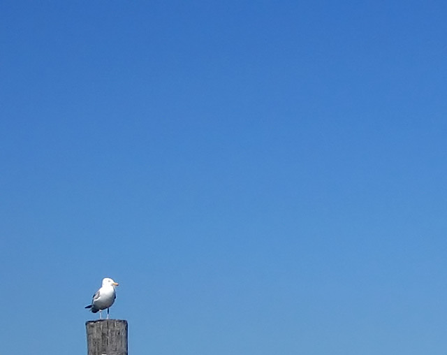
| He's a little overexposed imo. nice use of neg space though. |
|
 Photographer found comment helpful. Photographer found comment helpful. |
|
|
06/24/2007 01:26:00 PM |
| the focus isn't too good. |
|
| Photographer found comment helpful. |
|
|
06/22/2007 10:23:41 PM |
| Perhaps if you cropped this a little tighter it would have more impact. Nice idea. Huge area of blue doesn't make the bird interesting (IMO) and I want to see him! |
|
| Photographer found comment helpful. |
|
|
06/22/2007 06:07:21 PM |
| i dont think the negative space bring out tension in this photo. its more dull. |
|
| Photographer found comment helpful. |
|
|
06/21/2007 09:47:33 PM |
| Not much NS here. It's all crowded into the lower left. |
|
|
|
06/20/2007 03:12:49 PM |
| sharpening artifacts around the bird. So much space, so little bird. I think your effort to provide maximum negative space aloowed oyur composition to suffer a little. |
|
| Photographer found comment helpful. |
|
|
06/20/2007 12:11:41 PM |
To make this work, the bird and the pole should be really sharp, else they do not attract the eye.
I found out that side-lighting early or late in the day is great for birds, it enhances their graceful shape.
Just my 2 cents, because I like your idea. |
|
| Photographer found comment helpful. |
|
|
06/20/2007 11:08:12 AM |
| A little more of the post, maybe an inch up on the sky would create a better effect IMO. |
|
| Photographer found comment helpful. |
Home -
Challenges -
Community -
League -
Photos -
Cameras -
Lenses -
Learn -
Help -
Terms of Use -
Privacy -
Top ^
DPChallenge, and website content and design, Copyright © 2001-2025 Challenging Technologies, LLC.
All digital photo copyrights belong to the photographers and may not be used without permission.
Current Server Time: 03/11/2025 12:43:12 PM EDT.