| Author | Thread |
|
|
09/16/2002 08:25:00 AM |
Thanks for your comments. I left a post in the forum, because I would like to discuss it more here: //www.dpchallenge.com/forum.asp?action=read&FORUM_POST_ID=26547
|
|
Comments Made During the Challenge  |
|
|
09/15/2002 02:23:00 PM |
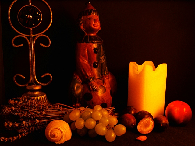
| excellent work with the lighting :) I love the soft yellow glow on this photo... I would like to see the fruits play a little more prominent role in the image... good work :) = 7 - jmsetzler |
|
 Photographer found comment helpful. Photographer found comment helpful. |
|
|
09/15/2002 01:50:00 PM |
| Nice lighting and the colour ties everything together. I think the arrangement of the objects bay have been stronger, or maybe better if they were limited... just a thought! |
|
| Photographer found comment helpful. |
|
|
09/14/2002 01:43:00 PM |
| cut off the top of the fixture on the left??? |
|
| Photographer found comment helpful. |
|
|
09/13/2002 05:52:00 PM |
| hm. i'm not sure what to make of your photo. so let me start with the things i like. the lighting is very nice, i like all the warm tones, and the black background is great, too. the candle is the brightest object in the photo, and therefore to me the main object, not the fruit. and i don't think i'm quite getting the reason for why you put the objects into the photo that you did, but that is probably just me. so, technically a good photo, you would've scored higher though if the fruit was more of the central object in my opinion. -- gr8photos (5) |
|
| Photographer found comment helpful. |
|
|
09/13/2002 01:04:00 AM |
| Quite the array of stuff in this picture - not sure how it's all related. Guess the photo title is the clue? Nice focus and color on the items in front. Some may say the background is a little dark, but I think it works well enough in this photo. |
|
| Photographer found comment helpful. |
|
|
09/12/2002 12:21:00 AM |
|
| Photographer found comment helpful. |
|
|
09/11/2002 08:25:00 PM |
Composition: Subject Placement, Cropping, Background6,
Technical: Focus, Exposure, Lighting, Processing5,
Appeal: Is it Interesting, Motivating, Etc.? 5,
Total Averaged Rating5. Autool
|
|
| Photographer found comment helpful. |
|
|
09/11/2002 06:37:00 PM |
| I like the lighting. Very serene |
|
| Photographer found comment helpful. |
|
|
09/11/2002 01:15:00 PM |
| NIce effort, but way too dark! |
|
| Photographer found comment helpful. |
|
|
09/11/2002 10:50:00 AM |
Cropped the top of the object on the left, that bothered me. Lighting is moody, but why?
Good shot over all. 6 |
|
| Photographer found comment helpful. |
|
|
09/10/2002 08:53:00 PM |
This is unique...I bet NO ONE will have an arrangement like it! You score high for originality! Very mood provoking! Has an nostalgic feel... Nice!
Good luck in the challenge! Grayce...aka...Gracious |
|
| Photographer found comment helpful. |
|
|
09/10/2002 05:35:00 PM |
| Very nice arrangement with a "Renaissance" mood. I like how you've controlled the lighting to enhance the mood. |
|
| Photographer found comment helpful. |
|
|
09/10/2002 10:59:00 AM |
| Way to many inrelated elements (sorry, if this is a collection of some religious ceremonial significance)ad they crowd the boarders. Lose the sea shell, he doesn't belong and he;s too bright, leave the brightness off the the candle/ Try to make it look like the really is candle is the only light source which means fix the lighting on that nut or fig. ANd give the sculpture things room to breathe at the top. It doesn't contribute to the composition to have them cut off. |
|
| Photographer found comment helpful. |
|
|
09/10/2002 08:41:00 AM |
| good still life composition |
|
| Photographer found comment helpful. |
|
|
09/09/2002 08:24:00 PM |
| Serene and peaceful scene 7 sjgleah |
|
| Photographer found comment helpful. |
|
|
09/09/2002 04:52:00 PM |
| Really neat shot, but it's so very dark. The brass item has lost much of it's detail, esp. in the center of the circle, same for the statue figurine, and the item on the far right of the candle is ...what? 7 Swash |
|
| Photographer found comment helpful. |
|
|
09/09/2002 03:16:00 PM |
| I think this might be a bit underexposed but still a pretty good shot. |
|
| Photographer found comment helpful. |
|
|
09/09/2002 12:14:00 PM |
| Seems a little busy to me. Perhaps fewer accessories would improve the overall photo. Quite diverse! |
|
| Photographer found comment helpful. |
|
|
09/09/2002 12:05:00 PM |
| nice and profund but a bit to dark... |
|
| Photographer found comment helpful. |
Home -
Challenges -
Community -
League -
Photos -
Cameras -
Lenses -
Learn -
Help -
Terms of Use -
Privacy -
Top ^
DPChallenge, and website content and design, Copyright © 2001-2025 Challenging Technologies, LLC.
All digital photo copyrights belong to the photographers and may not be used without permission.
Current Server Time: 03/12/2025 08:01:21 AM EDT.