| Author | Thread |
|
|
09/16/2002 03:40:00 AM |
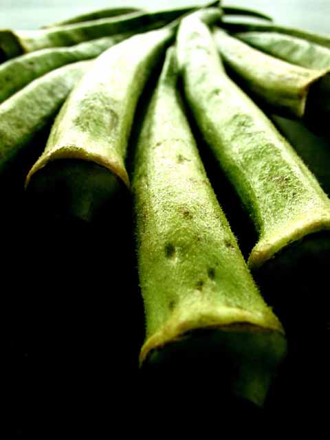
| In my opinion, this is the most underrated photo of the week. This got one of my 2 10s. I think it's original and well done - great texture, great shapes, good lighting, etc etc. Maybe people just don't know what okra is. |
|
Comments Made During the Challenge  |
|
|
09/15/2002 09:38:00 AM |
| I love this photo! It's hard to say why. The vibrant colours, soft focus, and weird, alien shapes, as well as the contrast between the green areas and the darkness in the lower part of the photo. It's all very appealing to me. One of my 10s - lisae |
|
|
|
09/15/2002 01:48:00 AM |
good attempt at something more different than 'a pile of fruit and/or veg'
Bit too dark at the bottom makes it overall feel heavy.
Gordon |
|
|
|
09/14/2002 08:15:00 PM |
Composition: Subject Placement, Cropping, Background5,
Technical: Focus, Exposure, Lighting, Processing5,
Appeal: Is it Interesting, Motivating, Etc.? 6,
Total Averaged Rating5. Autool
|
|
|
|
09/14/2002 06:39:00 PM |
| great use of light and darknes.. |
|
|
|
09/14/2002 01:46:00 PM |
|
|
|
09/14/2002 01:37:00 PM |
| Great perspective and lighting! |
|
|
|
09/14/2002 05:06:00 AM |
|
|
|
09/13/2002 07:33:00 PM |
| I like this shot, but I'm wondering if it may have worked out better with a different DOF. |
|
|
|
09/13/2002 05:37:00 PM |
|
|
|
09/13/2002 09:53:00 AM |
| this is my favorite shot this challenge. i love the perspective, the depth of field, the soft yet vibrant colors, and all that great looking negative space. just a great composition. one of the few 10s i give on this site. |
|
|
|
09/13/2002 05:48:00 AM |
Unusual perspective and interesting contrasts.
7, Kavey |
|
|
|
09/12/2002 04:31:00 PM |
| interesting photo, little bright in the middle 7--shutterlfy |
|
|
|
09/12/2002 11:56:00 AM |
| Great balance of space vs. negative space. I like the stark GREEN. The lighting is super, and the background color is right on in that it quietly supports the rest of the image. Strong 9. |
|
|
|
09/11/2002 10:59:00 AM |
| Simply and absolutely wonderful shot. I work in advertising and I have done dozens of magazine food ads and this is what I want to see..Beautiful presentation, color..very painterly and perfect...10..hokie |
|
|
|
09/11/2002 09:17:00 AM |
| Someone who had never seen okra before once asked me to describe it...my reply was "a fuzzy green bean", which doesn't sound too appetizing. LOL. I like the photograph, but perhaps could have shown one cut in two, they have a nice shape. |
|
|
|
09/11/2002 04:56:00 AM |
| Very nice. This is the best looking okra I've ever seen! Great job with the lighting from dark to light. Good detail on the veggie. 10 - chrisab |
|
|
|
09/11/2002 12:41:00 AM |
|
|
|
09/10/2002 09:09:00 PM |
This is about the ONLY vegetable I don't like...but of course I won't hold that against you.....lol Interesting perspective, but a little soft on the focus.
Good luck in the challenge! Grayce...aka...Gracious |
|
|
|
09/09/2002 04:11:00 PM |
| nice arrangement of the okra. i wish you could have used greater DOF ( and i'm aware that this may be a camera limitation) and there was a little less black in the foreground. -- gr8photos. |
|
|
|
09/09/2002 03:03:00 PM |
I love the perspective on this one!
|
|
|
|
09/09/2002 11:30:00 AM |
| Good shot Ć¢€“ good idea - superb compositionĆ¢€Ā¦ Slight problem with exposure? (8) |
|
Home -
Challenges -
Community -
League -
Photos -
Cameras -
Lenses -
Learn -
Help -
Terms of Use -
Privacy -
Top ^
DPChallenge, and website content and design, Copyright © 2001-2025 Challenging Technologies, LLC.
All digital photo copyrights belong to the photographers and may not be used without permission.
Current Server Time: 03/12/2025 02:28:41 PM EDT.