| Author | Thread |
|
|
01/24/2004 02:42:22 PM |
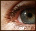
| Thanks for all the comments. This photo kinda sucked. I rushed on it. I hadn't entered a challenge in 6 months, I was so eger to submit something... and I didn't take my time. |
|
Comments Made During the Challenge  |
|
|
01/19/2004 07:37:32 PM |
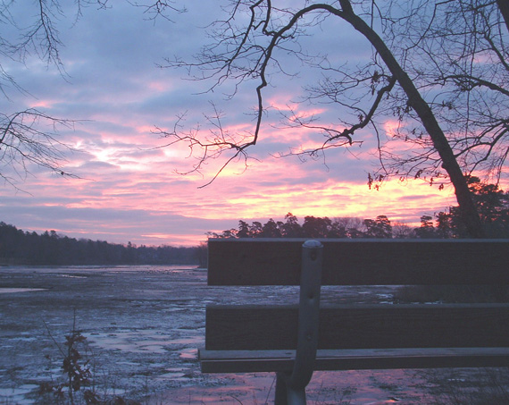
| Try lowering your gamma and increasing saturation for this one. Should come out beautiful |
|
|
|
01/19/2004 12:27:17 PM |
| lovely sky. image could use adj in levels/curves to strengthen the blacks (which would, in turn bring out the sky even more). |
|
 Photographer found comment helpful. Photographer found comment helpful. |
|
|
01/19/2004 12:08:59 AM |
| nice perspective but photo looks washed out |
|
|
|
01/18/2004 12:43:37 PM |
| Nice coloring, but could be a little sharper. |
|
|
|
01/18/2004 12:09:32 AM |
| Nice scene, good lighting, but I think it needs to have levels adjusted. Seems not to have any real black, or subjectively speaking, appears very low contrast. I understand you are trying to show POV here, but I am not sure the aesthetics are good for the placement of the bench. I would guess a wider view, including the whole bench, might have been a bit better compositionally. |
|
| Photographer found comment helpful. |
|
|
01/17/2004 08:02:27 PM |
| Very nice composition, I like it a lot. |
|
|
|
01/17/2004 06:48:32 PM |
| lower dark levels to improve |
|
|
|
01/16/2004 11:49:02 PM |
| Contrast is not right, and color is washed out. |
|
|
|
01/16/2004 11:10:50 AM |
| Appears to me to be washed out some. Nice scene, although it's not a special POV to me. |
|
|
|
01/15/2004 09:44:30 AM |
|
|
|
01/14/2004 09:06:59 PM |
| It's a nice sunset, but adding the bench seems to make the shot better. Good use of point of view, this is what I believe this challenge was suppose to be about. It could maybe use a little more contrast. |
|
| Photographer found comment helpful. |
|
|
01/14/2004 11:28:35 AM |
| nice shot but litle lack of contrast |
|
|
|
01/14/2004 09:53:10 AM |
| Nice shot, incredible light and colors. |
|
|
|
01/14/2004 06:36:42 AM |
| The composition is good, also the "point of view" aspect. The whole photo is however flat and unsaturated. The blacks aren't black enough and the reds and yellows need more contrast. |
|
| Photographer found comment helpful. |
|
|
01/14/2004 01:10:58 AM |
|
Home -
Challenges -
Community -
League -
Photos -
Cameras -
Lenses -
Learn -
Help -
Terms of Use -
Privacy -
Top ^
DPChallenge, and website content and design, Copyright © 2001-2025 Challenging Technologies, LLC.
All digital photo copyrights belong to the photographers and may not be used without permission.
Current Server Time: 03/11/2025 01:49:45 PM EDT.