| Author | Thread |
Comments Made During the Challenge  |
|
|
09/14/2002 01:54:00 PM |
|
|
|
09/14/2002 01:43:00 PM |
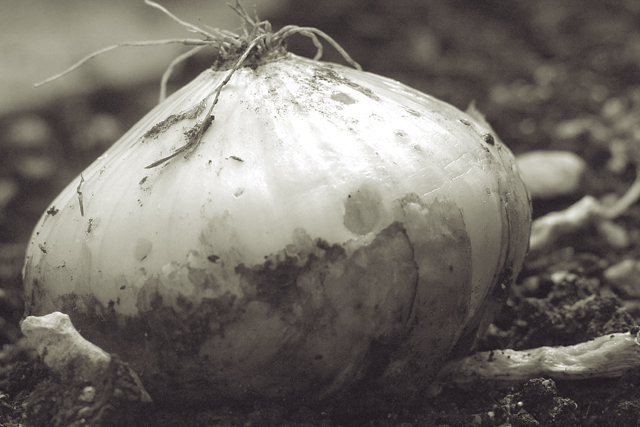
| Great choice of black and white! |
|
|
|
09/14/2002 11:01:00 AM |
| Very nice study in duotone. I like the textures and contrasts in this photo. It has a subtle beauty compared to many other photos this week. I'm giving it 10 - lisae |
|
|
|
09/13/2002 02:24:00 PM |
| Good detail, and dof on this one. Teh bw works well I think. karmat |
|
|
|
09/13/2002 09:54:00 AM |
| this is very very nice. black and white yields a very artisitic look. great control on your depth of field and lighting. nicely done. 9. |
|
|
|
09/13/2002 07:54:00 AM |
| I'll bet you get a lot of complaints about "Fruits and Veggies should be in COLOUR" Well I love this picture. There really isn't anything wrong with it except you're crowding the edges of your picture. Leave just a little more room around the sides and you'll be better off. My favourite this week 10-BigSmiles |
|
|
|
09/13/2002 06:06:00 AM |
A very earthy feel captured here.
7, Kavey |
|
|
|
09/11/2002 09:33:00 PM |
Composition: Subject Placement, Cropping, Background8,
Technical: Focus, Exposure, Lighting, Processing9,
Appeal: Is it Interesting, Motivating, Etc.? 6,
Total Averaged Rating8. Autool
|
|
|
|
09/11/2002 10:55:00 AM |
| Very organic and nice black and white...a little more detail (the roots not cut off..) of the top of the onion would have scored higher with me personal preference on a nice shot:-)...8..hokie |
|
|
|
09/10/2002 07:05:00 PM |
| A very nice shot. It doesn't "wow" me, but then again I wouldn't rule out framing it and hanging it on my kitchen wall. I like the lighting and composition. lhall-7 |
|
|
|
09/10/2002 01:38:00 PM |
|
|
|
09/10/2002 07:02:00 AM |
| Nice use of B&W and DOW� (7) |
|
|
|
09/10/2002 04:07:00 AM |
Composition: Subject Placement, Cropping, Not quite right maybe portrait mode would have been better,
Technical: Focus, Exposure: good
Appeal: the lighting good
Total Averaged Rating 6. sulamk |
|
|
|
09/10/2002 12:19:00 AM |
| I like the use of contrasting colors. |
|
|
|
09/09/2002 09:44:00 AM |
| I'm not sure the black and white adds much to this picture. perhaps if there was abit more contrast, it would add to it, but as it stands, the picture just seems to flow, with no particular interest in any one place. I don't think the onion stands out enough. GOod creativity and idea though. |
|
Home -
Challenges -
Community -
League -
Photos -
Cameras -
Lenses -
Learn -
Help -
Terms of Use -
Privacy -
Top ^
DPChallenge, and website content and design, Copyright © 2001-2025 Challenging Technologies, LLC.
All digital photo copyrights belong to the photographers and may not be used without permission.
Current Server Time: 03/12/2025 08:30:07 PM EDT.