| Author | Thread |
|
|
07/18/2007 06:52:20 PM |
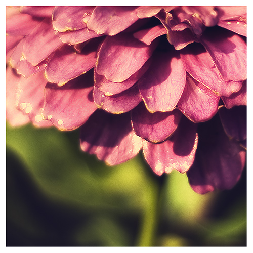
| great detail on the pedles |
|
 Photographer found comment helpful. Photographer found comment helpful. |
|
|
07/16/2007 10:17:59 PM |
| Thanks for all the PP tips! I really like what you achieved on this one so I'll definately be trying it. |
|
| Photographer found comment helpful. |
|
|
07/12/2007 06:09:11 AM |
| Totally cool especially the detail of the close up, and the DOF is quite magical as well..... |
|
| Photographer found comment helpful. |
|
|
07/12/2007 01:33:37 AM |
i love this, and i'm not a flower person, i had just about given up
on the 30 day, i may try again after seeing this :) |
|
| Photographer found comment helpful. |
|
|
07/12/2007 12:06:27 AM |
| I like the color contrast between the top of the picture and the bottom. |
|
| Photographer found comment helpful. |
|
|
07/11/2007 02:20:06 PM |
| Nice macro shot, the color of the flower is very pretty. Nice bokeh too |
|
| Photographer found comment helpful. |
|
|
07/11/2007 09:38:16 AM |
Nice colors, textures, and composition.
Thanks for the process notes. I'll have to try that technique. |
|
| Photographer found comment helpful. |
|
|
07/11/2007 04:15:51 AM |
LOVE the processing on this. In reading your instructions, I can see why I am so many miles behind so many people regarding processing -- I have only the faintest idea how to do the things you listed, and I never in a million years would have figured that combination of steps out on my own.
I love the crop, too. |
|
| Photographer found comment helpful. |
|
|
07/10/2007 04:54:07 PM |
| Good job on the processing. The composition really stands out here with the yellowish green running along bottom of the flower. |
|
| Photographer found comment helpful. |
|
|
07/10/2007 04:32:26 PM |
Love the tones in this photo! The contrast between macro and bokeh is awesome. Great job!
If your swimsuit shopping is anything like mine, you either need therapy or tequila afterward. Best both, actually. :o) |
|
| Photographer found comment helpful. |
|
|
07/10/2007 12:44:07 AM |
| I need to learn that trick, this is amazing. The color of the flower is awesome, it does have an aged look to it, yet still so vibrant & fresh. |
|
| Photographer found comment helpful. |
Home -
Challenges -
Community -
League -
Photos -
Cameras -
Lenses -
Learn -
Help -
Terms of Use -
Privacy -
Top ^
DPChallenge, and website content and design, Copyright © 2001-2025 Challenging Technologies, LLC.
All digital photo copyrights belong to the photographers and may not be used without permission.
Current Server Time: 04/07/2025 04:28:25 AM EDT.