| Author | Thread |
|
|
11/24/2002 06:07:00 PM |
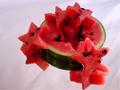
Salad for Caesar
Olympus E20
Interestingly enough it appears I didn't vote on this photo. <?> I think I was out of town during that challenge.
This photo is colorful and it fits the challenge well along with good focus and lighting.
The weakest area is the composition. It's sparse and looks stiff. Also the proportions are too small for the top of the pillar. Maybe large green lettuce leaves, a knife, or water would of filled in some of the negative area. The color is so nice here but there isn't enough of it. The background is very white as is the pillar making the upper left look a bit over exposed. This could easily be corrected.
I will also add,..... had I taken this shot I'd of dropped the camera down about a foot getting closer to the subject. My over all opinion of this photo is good.
|
|
Comments Made During the Challenge  |
|
|
09/15/2002 03:38:00 PM |
| this image reminds me of something i would see printed and framed in a chef's kichen ... classic style and simple, crisp colors - good job :) 7-ayme |
|
 Photographer found comment helpful. Photographer found comment helpful. |
|
|
09/15/2002 03:13:00 PM |
| Nice Clean Photo, I like the mosture on the tomatos. 8 Niten |
|
| Photographer found comment helpful. |
|
|
09/15/2002 03:07:00 PM |
| Good colors, nice light. I like the moisture on the tomatos. The shot doesn't really say much to me emotionally, though. Maybe too much empty space? Or just not much connection to "Caesar"? |
|
| Photographer found comment helpful. |
|
|
09/15/2002 02:40:00 PM |
| Awesome lighting, vivid colors and contrast. Nice composition too. Title/theme doesn't quite make it in my mind...but a lot of things don't so don't take it personally. Lisa |
|
| Photographer found comment helpful. |
|
|
09/15/2002 02:15:00 PM |
| very nice! The use of lighting here is excellent... I like the composition here as well... good shot ! = 8 - jmsetzler |
|
| Photographer found comment helpful. |
|
|
09/14/2002 10:10:00 PM |
|
|
|
09/14/2002 08:29:00 PM |
Composition: Subject Placement, Cropping, Background6,
Technical: Focus, Exposure, Lighting, Processing7,
Appeal: Is it Interesting, Motivating, Etc.? 5,
Total Averaged Rating6. Autool
|
|
| Photographer found comment helpful. |
|
|
09/14/2002 01:39:00 PM |
|
|
|
09/14/2002 01:22:00 PM |
| Very nice idea to use the pedestal. Very good contrast to show off the stars of the show. Good luck in the callenge. Gracious aka Grayce |
|
| Photographer found comment helpful. |
|
|
09/14/2002 09:38:00 AM |
Good trick with the title :) I like the way you have layed out the fruit on top of the collumn, but I think it needs something else on the right hand side, to sort of balance the picture out. You've got a nice angle on the column aswell, and i really like the drops on the tomatos. One thing i'm not too keen on in this photo is the background. It looks like you've used a sheet, because I can see places where it is raised up, and I think it kinda takes away alot of the clarity that the column creates. Also, the top left looks very blown out.
7
Konador |
|
| Photographer found comment helpful. |
|
|
09/14/2002 01:52:00 AM |
| Uh, except none of those things were known/available in Europe or Asia before the 1500s. |
|
|
|
09/13/2002 05:25:00 PM |
| hehe, this is funny! very nice composition and lighting, too. 9--amitchell |
|
| Photographer found comment helpful. |
|
|
09/13/2002 03:22:00 PM |
| Creative use of lighting to add impact to this image. |
|
| Photographer found comment helpful. |
|
|
09/13/2002 03:20:00 PM |
| I like the set up of this. Is there a reason for the veggies to be positioned as they are? If so, I confess I missed it. If not, it may be more effective to mix them up a bit. karmat |
|
|
|
09/13/2002 11:57:00 AM |
| The tomatoes alone would have worked better (or the peppers, or the...) |
|
|
|
09/12/2002 05:52:00 AM |
| This is a classic still life composition with great use of colours and placement. Only flaw � because it's slightly over exposed top left, the background becomes a little too dominant because of lost uniformity. Notice how relaxing the bottom of the shot is when compared with the top. Other than that, it's still a very good shot� (8) |
|
| Photographer found comment helpful. |
|
|
09/12/2002 05:19:00 AM |
| LOL - great pun but are these really the compoents of a ceasar salad? Regardless the focus, light and framing are great. 8 - floyd |
|
| Photographer found comment helpful. |
|
|
09/12/2002 02:58:00 AM |
| I'm thrown by the title, cuz i don't think those are the ingredients of the caesar salad. Maybe the image could stand alone (i.e., w/o a a title.) 5 sjgleah |
|
|
|
09/11/2002 08:28:00 PM |
| Very interesting. Nice angle. |
|
|
|
09/11/2002 05:25:00 PM |
| Even with the strong lighting to the side, it isn't too harsh. I also like the perspective, tho a shallower DOF (blurring the bottom of the column) is nice. It's an interesting composition if not a little staged which works well with the formality of the photo. The colors stand out nicely against the bg. What's with the wrinkles? ;oP ~indigo997 |
|
|
|
09/10/2002 10:42:00 PM |
| Caesar Salad ! YUM ! You did this well. I love the concept and colors in this. The textures are wonderful ! Shiiizzzam |
|
|
|
09/09/2002 06:21:00 PM |
| a bit overexposed in the upper left corner, but i like the water droplets on the tomato! |
|
| Photographer found comment helpful. |
|
|
09/09/2002 05:25:00 PM |
| absolutely great! the best in this challenge. |
|
| Photographer found comment helpful. |
|
|
09/09/2002 03:08:00 PM |
| nice idea. maybe a different color backdrop than white? |
|
|
|
09/09/2002 02:37:00 PM |
| Awesome photo. Worthy of framing. |
|
| Photographer found comment helpful. |
Home -
Challenges -
Community -
League -
Photos -
Cameras -
Lenses -
Learn -
Help -
Terms of Use -
Privacy -
Top ^
DPChallenge, and website content and design, Copyright © 2001-2025 Challenging Technologies, LLC.
All digital photo copyrights belong to the photographers and may not be used without permission.
Current Server Time: 03/12/2025 05:38:14 PM EDT.