| Author | Thread |
|
|
01/26/2004 09:21:40 PM |
| Very Well Done! Should have been in top 10. |
|
 Photographer found comment helpful. Photographer found comment helpful. |
Comments Made During the Challenge  |
|
|
01/21/2004 10:57:00 AM |
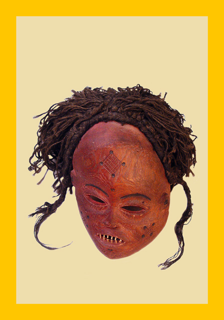
| Nice placement of the mask. If this were a real magazine, it would leave space for some text above it. The yellow border is very reminiscent of the National Geographic style. |
|
| Photographer found comment helpful. |
|
|
01/21/2004 07:36:57 AM |
| again with these staged shots, I think a natural background would do wonders. stone wall wooden rust anything. |
|
| Photographer found comment helpful. |
|
|
01/21/2004 01:56:34 AM |
|
| Photographer found comment helpful. |
|
|
01/20/2004 09:43:00 PM |
|
| Photographer found comment helpful. |
|
|
01/20/2004 10:25:38 AM |
| Meets the challenge theme well, but the angle you've shot your subject in seems odd. It's also placed in the frame awkwardly. The yellow border is not necessary except for cover pages. |
|
| Photographer found comment helpful. |
|
|
01/20/2004 08:12:44 AM |
| I can almost see the titles on the page it fits the challenge so well. |
|
| Photographer found comment helpful. |
|
|
01/19/2004 11:16:08 PM |
| Wow! That looks like it could actually be an issue of National Geographic. |
|
| Photographer found comment helpful. |
|
|
01/19/2004 03:59:47 PM |
| Wow, where-ever did you get the model for this shot? Great job getting the national geogrphic look |
|
| Photographer found comment helpful. |
|
|
01/19/2004 01:38:55 PM |
| Fits the challenge. Look authentic (is it?). Could have been made more interesting with another mask or artifact in the picture. Nicely done! |
|
| Photographer found comment helpful. |
|
|
01/19/2004 12:38:40 PM |
| The border and background hurt this image. |
|
| Photographer found comment helpful. |
|
|
01/19/2004 09:47:15 AM |
| I don't personally care for the background in this shot, it makes the head appear as if it is floating in nowwhere and seems unnatural to me. Interesting artifact though. |
|
| Photographer found comment helpful. |
|
|
01/19/2004 08:09:37 AM |
Extra credit for the yellow border and background! Good think you left room for the title and the articles! ;)
Mask angle is interesting and highlights the top/hair. I assume you found that more interesting than the mouth/chin (I think I would like to see more of those). In all a great execution of the theme. |
|
| Photographer found comment helpful. |
|
|
01/19/2004 02:22:54 AM |
| I commend you for the concept. A tighter composition would be better though. Great work. |
|
| Photographer found comment helpful. |
|
|
01/19/2004 01:55:09 AM |
| That looks like an old NG cover I remember from childhood. Was always full of the masks that were scary to little kids. Nicely done. |
|
| Photographer found comment helpful. |
|
|
01/19/2004 12:07:24 AM |
| I like the mask- personally, the yellow border is a bit distracting though |
|
| Photographer found comment helpful. |
Home -
Challenges -
Community -
League -
Photos -
Cameras -
Lenses -
Learn -
Help -
Terms of Use -
Privacy -
Top ^
DPChallenge, and website content and design, Copyright © 2001-2025 Challenging Technologies, LLC.
All digital photo copyrights belong to the photographers and may not be used without permission.
Current Server Time: 04/02/2025 12:55:57 AM EDT.