| Author | Thread |
|
|
02/01/2004 10:35:52 AM |
|
|
|
01/26/2004 12:48:32 PM |
| wow, i really thought this was one of the best here, maybe if you put a yellow boarder around it people would have voted higher!! ;) -10 from me. |
|
Comments Made During the Challenge  |
|
|
01/25/2004 07:46:19 PM |
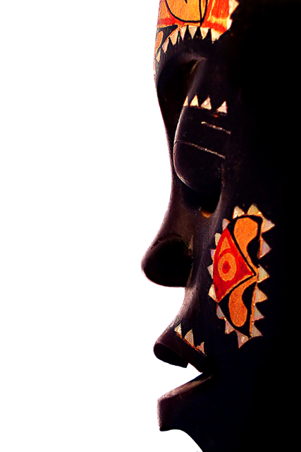
| excellent angle...background is almost too bright...looks like the tip of the nose is little fuzzy. |
|
 Photographer found comment helpful. Photographer found comment helpful. |
|
|
01/24/2004 12:35:27 PM |
| I love the composition and think the subject matter fits the challenge theme very well. Very interesting angle of view. I can see this being a picture in NG. The mask could probably use some more light as it appears too dark and you've lost some detail there. Well done, nonetheless. |
|
| Photographer found comment helpful. |
|
|
01/23/2004 11:34:47 PM |
|
| Photographer found comment helpful. |
|
|
01/23/2004 07:05:30 PM |
|
| Photographer found comment helpful. |
|
|
01/23/2004 02:57:32 AM |
I do like the strong contrast between the mask and the white background. Would have loved it to see some more details on the mask. Also the crop is too tight for my taste.
Like the strong colours. Good luck! |
|
| Photographer found comment helpful. |
|
|
01/22/2004 09:01:59 PM |
|
| Photographer found comment helpful. |
|
|
01/20/2004 12:18:20 PM |
| Nice framing... gives it a ying-yang complementary type of look. Stilll trying to figure out if there's a white face on the left. |
|
| Photographer found comment helpful. |
|
|
01/20/2004 08:05:28 AM |
| Good image, nicely composed to split the frame almost making it a double image. |
|
| Photographer found comment helpful. |
|
|
01/20/2004 06:38:05 AM |
| Good use of the negative space, and beatiful contrast between black and white. |
|
| Photographer found comment helpful. |
|
|
01/20/2004 05:38:02 AM |
| well lit like the slight backlighting. |
|
| Photographer found comment helpful. |
|
|
01/19/2004 10:49:24 PM |
| nice idea but maybe a little too much white |
|
| Photographer found comment helpful. |
|
|
01/19/2004 05:50:07 PM |
| I like the black on the white and the use of negative space in this shot, nice work. good luck in the challenge. 10 |
|
| Photographer found comment helpful. |
|
|
01/19/2004 04:36:08 PM |
| nice contrast between the white background and the darks and colors of the mask. it could almost be speaking. must be a beautiful piece. very NG, and has an average appeal. |
|
| Photographer found comment helpful. |
|
|
01/19/2004 01:12:58 PM |
| a bit more light and detail in the mask would really bring out the struture but a very graphic and strong entry |
|
| Photographer found comment helpful. |
|
|
01/19/2004 01:07:10 PM |
| You need a tribe of someone right in the background. |
|
| Photographer found comment helpful. |
|
|
01/19/2004 12:21:52 PM |
|
| Photographer found comment helpful. |
|
|
01/19/2004 10:41:10 AM |
| I think this is perfect for the challenge and the colors are nice. I do think that the white background takes away from the mask. It's so stark that it washes out the mask causing everything to look over exposed. It's a good entry. |
|
|
|
01/19/2004 10:29:25 AM |
| Most definately NG. Like the 50/50 composition but not sure about the white (great for contrast but doesn't add interest) Colors on the cheek made the composition complete. |
|
| Photographer found comment helpful. |
|
|
01/19/2004 01:02:10 AM |
| Well seen and well exposed! |
|
| Photographer found comment helpful. |
|
|
01/19/2004 12:37:15 AM |
| Nice mask! Fits the challenge very nicely! |
|
| Photographer found comment helpful. |
Home -
Challenges -
Community -
League -
Photos -
Cameras -
Lenses -
Learn -
Help -
Terms of Use -
Privacy -
Top ^
DPChallenge, and website content and design, Copyright © 2001-2025 Challenging Technologies, LLC.
All digital photo copyrights belong to the photographers and may not be used without permission.
Current Server Time: 03/12/2025 05:36:20 PM EDT.