| Author | Thread |
|
|
11/24/2002 08:02:00 PM |
Hi MarkRob!
This is in response to a critique request from 11-24-02 (Critique Club):
INITIAL: cool effect. catches my eye.
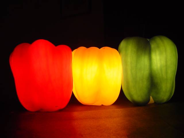
COMPOSITION -CONTENT - This is either shot at a diagonal, or the peppers are not really in line.. the result gives a skewed line effect. I am wondering if, since this is referring to a traffic signal, the composition in vertical would provide more impact, and strengthen the message. I like the dark backdrop, as it really makes the lit peppers stand out.. my eye esp. falls on the yellow pepper, however, the glare from the yellow pepper on the table/surface detracts from the "in a black space" effect that was obviously desired. Again, stacking the peppers vertically might further minimize this, since the glare is coming from the yellow pepper more than the others and would be in the middle of the set up, and away from the table/surface.
CAMERA WORK -TECHNICAL - The exposure of the green and yellow pepper are good. Texture and detail is visible. The red pepper loses detail - again, I think this may be caused by the angle or the pepper being out of line as it were. If it was in line, it would have just as much detail as the other two, because the distance to the lens would be the same as to the other two peppers.
DIGITAL PROCESSING - TECHNICAL - Unfortunately, this red pepper bothers me on this aspect as well. Perhaps oversaturated or post-edited in an attempt to save the focus or color or exposure of the pepper. Or maybe just over lit; there are artifacts and loss of detail in the red pepper.
YOUR OPINION ON THE PHOTO - I think this was a very creative idea. Not sure how it is connected to traffic lights, except thru imagination, but that's what pop art is about. It has a dry humor. I think the humor would be more pronounced if, again, done in vertical to more closely mimic the traffic lights. As it stands, it either takes a minute, or relies on the title to make the idea "dawn" on the viewer.
I had given this an 8 during the challenge, and my vote still stands. Why? This is not just average (5); the cleverness pushes it past that.. and could use some tweeking to give the full impact desired.
Karen Bryan
|
|
 Photographer found comment helpful. Photographer found comment helpful. |
Comments Made During the Challenge  |
|
|
09/15/2002 08:08:00 PM |
| Good idea and nice shootin. I think though it would have more impact without the reflection at the bottom and presented in portrait instead of landscape. =6 syamjonimi |
|
|
|
09/15/2002 02:21:00 PM |
| very unique concept :) The lighting on the red pepper may be a bid strong... the detail in that pepper isn't showing through as much as the other two... my camera has trouble with reds sometimes... = 7 - jmsetzler |
|
| Photographer found comment helpful. |
|
|
09/15/2002 04:02:00 AM |
|
|
|
09/14/2002 11:24:00 PM |
|
|
|
09/14/2002 02:01:00 PM |
|
|
|
09/14/2002 01:06:00 PM |
| I'm in awe of such cleverness. My mind just doesn't work that way, say kudos to you! The colors are great, and very effective. The focus is a little soft, especially the green. Good job anyway. Good luck in the callenge. Gracious aka Grayce |
|
|
|
09/14/2002 05:48:00 AM |
| This is stunning! Just love it. Kaz |
|
|
|
09/14/2002 03:20:00 AM |
| superb colours and lighting---good concept andrew |
|
|
|
09/13/2002 09:05:00 PM |
Composition - quite good
Technical Aspects - quite good
Meets Challenge - yes
Visual Impact / Originality � quite high
Other suggestions �
7
Jim msp
|
|
|
|
09/13/2002 06:17:00 PM |
| great idea and color 9 sgtpepper6344 |
|
|
|
09/13/2002 05:57:00 PM |
| wow, that is very creative! Love the colors. |
|
|
|
09/13/2002 05:57:00 AM |
Great lighting idea. Works best with red and yellow peppers.
7, Kavey |
|
|
|
09/13/2002 01:49:00 AM |
To me they look like 3 different colors of molars (teeth).
Your idea is very interestng. If I could recommend anything it would have been to soften the lighting a bit so that the characteristics of the red and yellow weren't so washed out. |
|
|
|
09/12/2002 02:36:00 PM |
| very cool idea, and nicely done with the lighting. i can see what you used to hold up the peppers, would be nice if you could've disguised that a little more. lastly, would the image look good turned by 90 degrees to more resemble a traffic light or would the reflection be distracting? not sure. good photo nonetheless. -- gr8photos (7) |
|
| Photographer found comment helpful. |
|
|
09/11/2002 09:42:00 PM |
Composition: Subject Placement, Cropping, Background8,
Technical: Focus, Exposure, Lighting, Processing7,
Appeal: Is it Interesting, Motivating, Etc.? 7,
Total Averaged Rating7. Autool
|
|
|
|
09/11/2002 09:11:00 AM |
| Nice lighting & cute title. |
|
|
|
09/10/2002 08:59:00 PM |
| Great lighting but soft focus. |
|
|
|
09/10/2002 08:18:00 PM |
| very nice and bright - good job! ayme-6 |
|
|
|
09/10/2002 12:17:00 PM |
| great concept, executed beautifully! |
|
|
|
09/09/2002 08:26:00 PM |
| Nice effect, and very clever. 7 sjgleah |
|
|
|
09/09/2002 06:22:00 PM |
| This has such a mystical effect. I am like it. The balance is great. = 8 Shiiizzzam |
|
|
|
09/09/2002 03:01:00 PM |
| Looks like pepper jack-o-lanterns! Nice color contrasts. karmat |
|
|
|
09/09/2002 01:44:00 PM |
| I really like this. The focus seems soft, but I am thinking that's due to the effect you were aiming for. Did you carve out the backs? To me, this effect worked much better for the green pepper than the red, the yellow falls in between. I think you needed a less bright light in (behind) the red pepper. 8 Swash |
|
|
|
09/09/2002 01:33:00 AM |
| cool. the red is a bit bright and so you lose the texture of the pepper though. nice job overall. |
|
Home -
Challenges -
Community -
League -
Photos -
Cameras -
Lenses -
Learn -
Help -
Terms of Use -
Privacy -
Top ^
DPChallenge, and website content and design, Copyright © 2001-2025 Challenging Technologies, LLC.
All digital photo copyrights belong to the photographers and may not be used without permission.
Current Server Time: 03/12/2025 02:58:12 AM EDT.