| Author | Thread |
Comments Made During the Challenge  |
|
|
09/15/2002 06:19:00 PM |
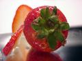
| This has nice color but would have been better if you didn't cut the pict in half with the subject. Also needed better focus on it. |
|
|
|
09/14/2002 08:22:00 PM |
Composition: Subject Placement, Cropping, Background7,
Technical: Focus, Exposure, Lighting, Processing8,
Appeal: Is it Interesting, Motivating, Etc.? 7,
Total Averaged Rating7. Autool
|
|
|
|
09/14/2002 01:59:00 PM |
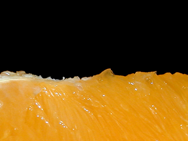
| Very striking contrast - I like the graphic design here. |
|
|
|
09/14/2002 01:26:00 PM |
| Colorful, juicy, a little too center, and uniform for my taste. Still nice though and I like the simplicity. Focus is good too. Good luck in the callenge. Gracious aka Grayce |
|
|
|
09/14/2002 09:38:00 AM |
| doesn't strike me... Maybe show some of the skin of the fruit next time... Very good color choices though. |
|
|
|
09/14/2002 02:23:00 AM |
| Neat idea. The ragged line between black and orange is interesting. It would have been nice to see more texture in the orange - maybe with lighting more to the side? |
|
|
|
09/14/2002 02:12:00 AM |
| Beautiful--world of orange--great shot andrewm |
|
|
|
09/13/2002 11:20:00 PM |
| OH that makes me thursty. Just wish the division wasn't so nearly even. |
|
|
|
09/13/2002 06:24:00 AM |
Wonder if it would be even better with more orange less black?
Rule of thirds and all that...?
8, Kavey |
|
|
|
09/12/2002 05:26:00 AM |
| Classic and clever use of highly contrasting colours and textures. Great use of macro too. (9) |
|
|
|
09/11/2002 09:19:00 PM |
| This looks very refreshing. It makes me think of a large orange ocean wave at night. Don't ask why, I can't answer. It's just the impression I get. Very well done. =9 syamjonimi |
|
|
|
09/11/2002 08:22:00 PM |
|
|
|
09/11/2002 04:19:00 PM |
OK, well gonna just say it straight - I don't like the over contrast/sharp spots - it distracts me - When I look at this, I keep focusing on those spots. I understand that they are most likely from the light shining on the juice of the orange, but I believe that it can be avoided and still have the appearance of being wet. Other than that, I really like this...Great orange color, Great composition and great execution of the black background. Also good detail (aside from the contrasted areas). Still wonderful work. 7
Ruthann |
|
|
|
09/11/2002 01:44:00 PM |
| I like this. And actually, it could have been submitted for the "negative space" challenge. A TINY bit over sharpened though. |
|
|
|
09/11/2002 11:06:00 AM |
|
|
|
09/10/2002 10:16:00 PM |
| Excellent use of negative space. Color is fabulous, as if the lighting. Well done. 8, just-married |
|
|
|
09/10/2002 07:07:00 PM |
| Makes your mouth pucker just to look at it, doesn't it?! Very nice, great lighting, and I think the composition definitely works. lhall-9 |
|
|
|
09/10/2002 05:03:00 PM |
|
|
|
09/10/2002 08:30:00 AM |
| You have captured the succulence very well. The color is shown off very well against the dark background. Nice shot. |
|
|
|
09/10/2002 02:07:00 AM |
| nice shot. looks like a mountain range of pulp and orange. (7) ~mcmurma |
|
|
|
09/09/2002 07:37:00 PM |
Nice shot!!
Personally, I would like the dark zone smaller... |
|
|
|
09/09/2002 05:20:00 PM |
| I'd like to surf this wave... delicious. |
|
|
|
09/09/2002 01:12:00 PM |
| good focus, I like the reflection of light |
|
|
|
09/09/2002 09:32:00 AM |
| nice macro. i could almost taste it! |
|
Home -
Challenges -
Community -
League -
Photos -
Cameras -
Lenses -
Learn -
Help -
Terms of Use -
Privacy -
Top ^
DPChallenge, and website content and design, Copyright © 2001-2025 Challenging Technologies, LLC.
All digital photo copyrights belong to the photographers and may not be used without permission.
Current Server Time: 03/12/2025 01:34:38 PM EDT.