| Author | Thread |
Comments Made During the Challenge  |
|
|
09/22/2002 06:42:00 PM |
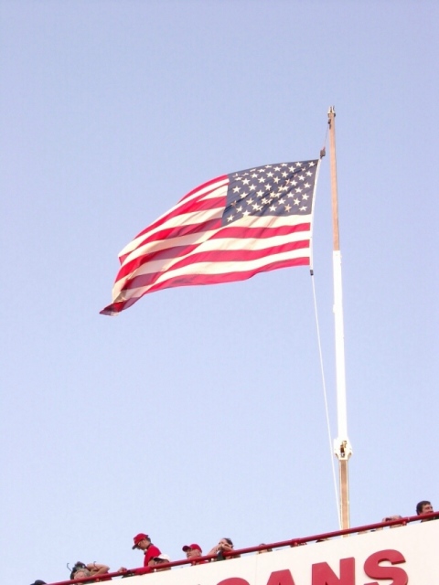
| Would vote it higher if you had cropped out the innocent bystanders at the bottom :-) Sorry! 5 nards656 |
|
|
|
09/21/2002 04:55:00 PM |
| This would be a good shot minus the crowd at the bottom of the photo. -6 |
|
|
|
09/21/2002 02:04:00 AM |
| I would have liked this one more if you cut out the bottom with the people and just had the flagpole. Great shot of the flag. 5 |
|
|
|
09/21/2002 12:09:00 AM |
| The people could be cropped out to make a better picture. |
|
|
|
09/20/2002 03:33:00 PM |
| Not sure if it was possible or not, but allowing more sky at the top and chopping the people off at the bottome would have made this much more effective, I think. |
|
|
|
09/20/2002 01:19:00 PM |
| very red white and blue, no, really... |
|
|
|
09/19/2002 02:15:00 AM |
|
|
|
09/18/2002 10:56:00 PM |
| I think I would have liked this picture better if the colors of the flag were a little more vibrant and if you had cropped out the people at the bottom. Overall, I like it though. |
|
|
|
09/18/2002 02:12:00 AM |
Composition: 5Lighting: 5
Appeal: 5, Total Rating 5 Sulamk
|
|
|
|
09/17/2002 11:54:00 AM |
| Flag needs more contrast. |
|
|
|
09/16/2002 07:53:00 PM |
| I find the colours rather dull. Try using a polariser next time. You could also improve this by adjusting the saturation etc. |
|
|
|
09/16/2002 06:01:00 PM |
| I can see it now...someone is going to complain that your flag is backwards. to me that seems rediculous. if we were only meant to see the flag with the stars in the upper left hand corner, then it wouldn't have 2 sides. I only say this because at photosig, seems like that is a huge deal. Personally, I like seeing it "backwards". I think this might have had a higher impact if the bottom people were cut out. Then it would just be the flag and the neg space. lighting is good, and angle and framing are also ok. the focus and clarity of the flag is good, and the neg space is clear. overall nice job. good luck in the challenge. ~Hbunch7187~ |
|
|
|
09/16/2002 05:52:00 PM |
| The people and the bottom in general distract from the flag. Also, a slight rotation to get the pole straight would help the picture. |
|
|
|
09/16/2002 05:14:00 PM |
| looks whited out, too bright. good idea |
|
|
|
09/16/2002 01:43:00 PM |
| I like flags :) I think this image may be a tad over exposed. The color is a tad flat because of the exposure possibly. - jmsetzler |
|
|
|
09/16/2002 11:10:00 AM |
Instead of cutting the people off at the bottom I think leaving them off would of been better. This way they are chopped! Good color, action on the flag and pole.
Score 6 Justine |
|
|
|
09/16/2002 09:08:00 AM |
|
|
|
09/16/2002 08:44:00 AM |
| Cropping out the people at the bottom and adding more sky would have given me a better sense of negative space. Nice sharp focus on the flag :) |
|
|
|
09/16/2002 01:18:00 AM |
| sorry, I don't see the flag as negative. |
|
Home -
Challenges -
Community -
League -
Photos -
Cameras -
Lenses -
Learn -
Help -
Terms of Use -
Privacy -
Top ^
DPChallenge, and website content and design, Copyright © 2001-2025 Challenging Technologies, LLC.
All digital photo copyrights belong to the photographers and may not be used without permission.
Current Server Time: 03/12/2025 09:29:40 AM EDT.