| Author | Thread |
|
|
08/26/2007 08:03:37 PM |
Hi Whiterook, you really need to try harder and not just enter something for the sake of it. Before entering a shot, do you ask yourself "Is this the best I can do for this challenge? Does it inspire? Do I feel that I have captured the essence of the scene?"
Or do you just blindly click the button and hope for the best?
Seriously, you need to take more time when thinking about entering a shot. Lots of people on this site will willingly offer you guidance. However, if you are just shooting for the hell of it the go for it dude!! |
|
Comments Made During the Challenge  |
|
|
08/14/2007 08:55:49 AM |
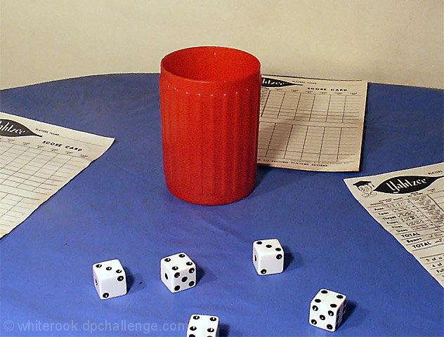
If you don't mind a couple of random thoughts:
the set up and composition you chose somehow sends a message it's done fast without real thinking your picture through to the end.
E.g. the paper: if you really play, the paper in the middle should be upside down, right? A person would sit at the top part of the round table and write his/her score. BTW: with what? there are no pencils/pens to record the score.
While cutting/cropping the sheets of paper is a design tool and good, cutting right through the dice is not a good idea. It only shows that when you took the pic or in PP you were not looking out for details. More details: if you show a full house, the game seems to go on already. Show this to me with at least some entries on the paper.
Lightin is from one side only, but with 2 lamps? Try moving one of them the the right and a bit further away (fill light). This way you could avoid these irritating 2 shadows. You wanted to show people playing? Isn't the light then coming from the top? from a lamp right over the table?
I think you see where I'm going? The scene you are showing seems more like a random collection of more or less connected items. Arrange them as it would appear in real life and your picture will come to life all by itself.
There are a tremendous amount of dust specs(?) in your picture. Check your camera, or if it's not your camera, these dust specs should be removed before you shoot. |
|
 Photographer found comment helpful. Photographer found comment helpful. |
|
|
08/11/2007 04:44:07 PM |
| Good concept, yet the setup seems a bit..I don't know...too far spread apart? Maybe a different background or if there was some writing on the score sheets. Seems to be lacking a unifying cohesiveness for me. |
|
| Photographer found comment helpful. |
|
|
08/11/2007 09:16:16 AM |
|
| Photographer found comment helpful. |
|
|
08/10/2007 08:12:19 AM |
|
|
|
08/09/2007 07:38:44 PM |
| Not sure what the focal point is in this picture. |
|
|
|
08/09/2007 01:35:06 PM |
| noisy and not very interesting |
|
|
|
08/09/2007 01:07:31 AM |
| I'm sorry, this just isn't interesting or creative at all... The lighting's bad, the composition's off and it's noisy. |
|
|
|
08/08/2007 09:52:28 PM |
| that's a "full house", not a "yahtzee"! :) |
|
| Photographer found comment helpful. |
|
|
08/08/2007 06:12:02 AM |
| you oversharpened it and it is a bit too simple to me. |
|
Home -
Challenges -
Community -
League -
Photos -
Cameras -
Lenses -
Learn -
Help -
Terms of Use -
Privacy -
Top ^
DPChallenge, and website content and design, Copyright © 2001-2025 Challenging Technologies, LLC.
All digital photo copyrights belong to the photographers and may not be used without permission.
Current Server Time: 03/12/2025 02:54:55 AM EDT.