| Author | Thread |
Comments Made During the Challenge  |
|
|
09/21/2002 06:48:00 PM |
|
|
|
09/21/2002 02:06:00 AM |
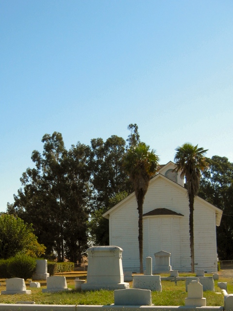
| Pretty picture. I like the two palm trees. The shadows are a little hard for this shot. 5 |
|
|
|
09/20/2002 01:57:00 PM |
|
|
|
09/20/2002 10:53:00 AM |
| I love the subject and title. Echoes my own faith. The image is not super clearly focused though, and could use a little brightness and contrast. Good luck in the challenge. Grayce aka Gracious |
|
|
|
09/20/2002 10:10:00 AM |
|
|
|
09/18/2002 08:48:00 PM |
| Just a thought here... I think if you had cropped the bottom tighter to eliminate the curb (or is it a fence?) it would have improved this shot tremendously... But that's just me :) Nice work |
|
|
|
09/18/2002 03:32:00 PM |
| Very nice, I like the vertical framing in this. As it is, I like the colors, but what would it look like in bw, with a lot of contrast? karmat |
|
|
|
09/16/2002 11:15:00 PM |
| I think I see a curb that chops the bottom a little. I would have preferred to see this photo from a low perspective aimed up at an angle. Straight on the focus is on the building. - bamaster (7) |
|
|
|
09/16/2002 07:54:00 PM |
| i dont know if you have noticed, but there is are a lot of photos this week related to God and death. probably due to 9-11 im guessing. |
|
|
|
09/16/2002 07:46:00 PM |
| Everything looks great except the building appears to be leaning to the left slightly. Except for that, the lighting is great, the angle and framing are good. The focus and clarity are good, and the neg space is very clear. Overall good job. Good luck in the challenge. ~hbunch7187~ |
|
|
|
09/16/2002 03:20:00 PM |
| I believe that your intention here is to use the sky as negative space... What I'm trying to decide is how it enhances or helps improve the impact of your subject... I'm not sure I understand... - jmsetzler |
|
|
|
09/16/2002 12:09:00 PM |
| Good idea, however the large space atop the photo does not directly benefit the composition. It might fare better as a regular crop. |
|
|
|
09/16/2002 10:57:00 AM |
| Good work. Score 7 Justine |
|
|
|
09/16/2002 06:57:00 AM |
Composition: very busy I dont think this represents negative space 4
Lighting: 4,
Appeal: 3, Total Rating4 Sulamk
|
|
Home -
Challenges -
Community -
League -
Photos -
Cameras -
Lenses -
Learn -
Help -
Terms of Use -
Privacy -
Top ^
DPChallenge, and website content and design, Copyright © 2001-2025 Challenging Technologies, LLC.
All digital photo copyrights belong to the photographers and may not be used without permission.
Current Server Time: 03/13/2025 08:32:54 AM EDT.