| Author | Thread |
Comments Made During the Challenge  |
|
|
01/30/2004 04:19:56 PM |
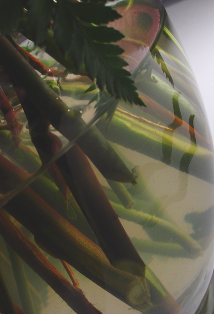
| Colours too faded and insipid for me. Composition is interesting. The wavy lines are not really attention grabbing enough. |
|
|
|
01/30/2004 01:07:30 AM |
| Somewhat washed out. I'd like to have seen a more distinctively clean glass vase with crisper reflections and more deeply colored stalks and leaves. As is, it's difficult to tell if it's just the water that's cloudy, or the glass and the water that's murky and dull. |
|
|
|
01/28/2004 07:31:36 PM |
| I understand your intent, but the water is a bit too murky. Maybe more light? Sorry. |
|
|
|
01/28/2004 02:38:40 PM |
|
|
|
01/28/2004 11:50:52 AM |
| I like this shot, but found the bottom right corner distracting, |
|
|
|
01/28/2004 11:17:46 AM |
|
|
|
01/28/2004 06:48:09 AM |
I like the interpretation and the fact that it is so clearly water without having to show it's water. I like the way it relies on the knowledge of the viewer to know that cut flowers will be in water.
My only crit is that the lighting is a little flat. I think harder light would have accentuated the straight lines of the stalks. The top right corner of white is a little distracting. It is good that it shows the edge of the glass but I dragged it into photoshop and recreated an off-white background and it took away some of the glare of white. It also had the benefit of making the whole picture "appear" more contrasty |
|
|
|
01/28/2004 01:36:43 AM |
| feels like there is a film over the image. very faded. even the part out of the water. could use adjustments in contrast. not the best composition. |
|
Home -
Challenges -
Community -
League -
Photos -
Cameras -
Lenses -
Learn -
Help -
Terms of Use -
Privacy -
Top ^
DPChallenge, and website content and design, Copyright © 2001-2025 Challenging Technologies, LLC.
All digital photo copyrights belong to the photographers and may not be used without permission.
Current Server Time: 03/14/2025 09:23:58 AM EDT.