| Author | Thread |
Comments Made During the Challenge  |
|
|
08/11/2007 09:45:41 AM |
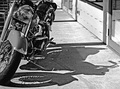
| I�m usually a 5 photographer here if I get that high in scoring, so take this for what its worth. My eye instead of being drawn to the upper left is pulled to the upper right, to the buildings. I think blurring those buildings and maybe converting to B&W would have helped the impact. My vote a 5. |
|
 Photographer found comment helpful. Photographer found comment helpful. |
|
|
08/10/2007 08:03:02 PM |
| nice use of line/pattern, however it doesn't have a really strong wow factor in my opinion. I think this could have benefited from a shallower depth of field so make the buisy houses and trees in the background less obvious |
|
| Photographer found comment helpful. |
|
|
08/08/2007 10:46:49 PM |
|
| Photographer found comment helpful. |
|
|
08/06/2007 07:25:19 AM |
| Nice use of lines and shadows. |
|
| Photographer found comment helpful. |
|
|
08/06/2007 06:37:33 AM |
| I love the cool colours of this image but think I would have tried to zoomin or pick a viewpoint wherethe houses in the top corner didn't show |
|
| Photographer found comment helpful. |
Home -
Challenges -
Community -
League -
Photos -
Cameras -
Lenses -
Learn -
Help -
Terms of Use -
Privacy -
Top ^
DPChallenge, and website content and design, Copyright © 2001-2025 Challenging Technologies, LLC.
All digital photo copyrights belong to the photographers and may not be used without permission.
Current Server Time: 03/13/2025 04:41:23 AM EDT.