| Author | Thread |
Comments Made During the Challenge  |
|
|
01/29/2004 11:08:11 PM |
| Ha ha I like this good focus and colour |
|
|
|
01/28/2004 07:30:47 PM |
| I don't know why, but when I view this I think of the Jackalope (from the Tonight Show - Leno). Or maybe even Caddy Shack. Oh well...... Good color, exposure, focus, etc., kind of funny. |
|
 Photographer found comment helpful. Photographer found comment helpful. |
|
|
01/27/2004 05:51:08 PM |
| you've incorporated a few great ideas into one great photo |
|
| Photographer found comment helpful. |
|
|
01/27/2004 09:53:57 AM |
| I realy like this picture the more I look at it. The text is a little rough though. But doesn't really take away from the overall picture. |
|
| Photographer found comment helpful. |
|
|
01/26/2004 02:49:19 AM |
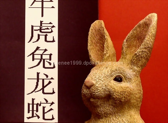
| Nice layout graphically. The jaggies are distracting on the characters and that the 'year' character is cut off at the top. But, I like the texture of the rabbit against the backdrop. |
|
| Photographer found comment helpful. |
|
|
01/25/2004 11:12:49 PM |
| I really like the obviously 'designed' aspect of this shot. The colour choice is effective and helps make the shot very elegant. However, I just wish that the font you used wasn't so pixelated. Kudos on making the rabbit look at his character. 6 |
|
| Photographer found comment helpful. |
|
|
01/25/2004 07:53:37 PM |
| Not really sure the background works for my here. I think I would like to see all one color for the background. I like the addition of the oriental letters. Kind of makes it tie in with the whole "chinese" zodiac theme, although I have no clue what it says or even what language it is. Your focus on the bunny is good, and Lighting is good, although there is a bit of a distracting shadow from the bunny on the darker 1/2 of the background. Overall good though. |
|
| Photographer found comment helpful. |
|
|
01/25/2004 05:07:51 PM |
| Graphically the photo is nice - the two color background, white banner through one side. The bunny is crisply portrayed. The banner is a bit odd - It doesn't go all the way to the bottom and seems cut off at the top. The bunny himself (herself?) is adorable, but a bit corny. The lighting seems a bit yellow, color correction would solve that. |
|
| Photographer found comment helpful. |
Home -
Challenges -
Community -
League -
Photos -
Cameras -
Lenses -
Learn -
Help -
Terms of Use -
Privacy -
Top ^
DPChallenge, and website content and design, Copyright © 2001-2025 Challenging Technologies, LLC.
All digital photo copyrights belong to the photographers and may not be used without permission.
Current Server Time: 03/12/2025 09:18:31 PM EDT.