| Author | Thread |
Comments Made During the Challenge  |
|
|
02/02/2004 08:55:17 PM |
| This is very pixelated... |
|
 Photographer found comment helpful. Photographer found comment helpful. |
|
|
01/31/2004 08:07:33 AM |
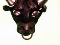
I think the picture has suffered a lot in having its resolution cut so dramatically (obviously not your fault). I have also open the picture up in Photoshop to see what that was in the top of the frame and the top right corner. Looking at it carefully it seems that it is the edge of a table possibly (may be wrong) but I think it should have been cropped out anyway. There is also a lot of light fall-off from front to back. It would have been better if you had been able to get higher and over the rings.
I am sure some will wonder if it fits the category (cultures who do not use the standard western zodiac signs) but I am happy that it does. I think it is also an original picture. The idea was certainly worth a try. But I think it need a little more thought and some cropping would have made a huge difference.
David
|
|
| Photographer found comment helpful. |
|
|
01/31/2004 01:18:21 AM |
| very grainy but like the idea |
|
|
|
01/30/2004 07:54:01 PM |
| This could have used a better light source - I'm not much at all for camera flash. The multi-color is a bit distracting, and the picture is very noisy (ISO too high). May have looked better in b&w or sepia. A better cropping job could have been used to even out the top portion of the picture too. Good luck! |
|
| Photographer found comment helpful. |
|
|
01/29/2004 06:09:57 PM |
| Horrible! Very poor quality and not at all interesting to look at. |
|
|
|
01/28/2004 10:59:25 PM |
| this image is extremely noisy and pixelated. sorry 1 |
|
|
|
01/28/2004 10:12:21 PM |
| unless you were going for some effect, it is over compressed and the jpg artifacts are very distracting |
|
|
|
01/28/2004 09:40:59 PM |
| Sorry, this sign doesn't do a thing for me, it's very one dimensional, oversharpened perhaps, and appears to have it's share of noise. |
|
|
|
01/28/2004 08:08:42 PM |
| Very, very pixelated, I'm afraid... try saving it at a higher quality (yours is only 20K; you can submit up to 150K). |
|
|
|
01/28/2004 07:03:45 PM |
| oversharpened, overcompressed. |
|
|
|
01/28/2004 04:28:52 PM |
| I really like the idea here. I wish it wasn;t so dark in most places & A LOT less pixelated. 3 |
|
|
|
01/28/2004 12:18:56 PM |
| May be it fits well: Strange Sign in a Noisy World. To many noise. Try to use NeatImage to process high noisy images. It does a great job. |
|
|
|
01/28/2004 10:52:49 AM |
| Pretty grainy. Not a very exciting shot. |
|
|
|
01/28/2004 01:52:56 AM |
| I don't really find much appealing photographically here... I mean you have your zodiac sign so it meets the challenge, but it's not a photo that could be considered artsy. Isorry but it just doesn't appeal to me. Also it looks pixelated for some reason... I"m not sure why. Anyway, I think you could have made this shot much more interesting using some different lighting or something... just an idea. |
|
|
|
01/28/2004 01:08:09 AM |
| By far too noisy and poorly illuminated. |
|
Home -
Challenges -
Community -
League -
Photos -
Cameras -
Lenses -
Learn -
Help -
Terms of Use -
Privacy -
Top ^
DPChallenge, and website content and design, Copyright © 2001-2025 Challenging Technologies, LLC.
All digital photo copyrights belong to the photographers and may not be used without permission.
Current Server Time: 04/26/2025 06:32:09 AM EDT.