| Author | Thread |
|
|
05/28/2009 07:18:55 AM |
| this is absolute genius, typography at its finest. |
|
 Photographer found comment helpful. Photographer found comment helpful. |
|
|
09/29/2008 03:36:10 PM |
I've been trying to do something like this and for an "r" I used the end of an iron handrail. Something like this but the one I found looked a little more "r" like...
 |
|
| Photographer found comment helpful. |
|
|
07/08/2008 10:22:29 AM |
| This is awesome. I particularly like your use of perspective to capture the "B". |
|
| Photographer found comment helpful. |
|
|
05/01/2008 06:13:02 PM |
Frankly, I think the "R" is one of the better ones. It shows unique vision. I agree with eyewave about the C and U - considering how you found the R, a C and U (in their correct orientation) shouldn't be difficult.
Overall an outstanding project though! |
|
| Photographer found comment helpful. |
|
|
01/21/2008 09:54:10 AM |
| I love this. I am thinking of doing this myself.....I couldn't join the side challenge in August when everyone did it. |
|
| Photographer found comment helpful. |
|
|
12/15/2007 01:52:08 PM |
|
| Photographer found comment helpful. |
|
|
08/31/2007 02:13:05 PM |
|
| Photographer found comment helpful. |
|
|
08/31/2007 01:10:38 PM |
| Can you say "the alphabet backwards". There I wrote it down, just read the previous quote out loud. You've done it! Shooting an alphabet looks ike fun, too. Great results. |
|
| Photographer found comment helpful. |
|
|
08/19/2007 06:13:27 PM |
| Great collage. This looks very good, well done. |
|
| Photographer found comment helpful. |
|
|
08/16/2007 06:19:17 AM |
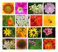
very, very nice shots (except for C and U, the rotating/flipping is too obvious), but the arrangement doesn't work for me. the gaps between the pics are irregular, they don't even keep the baseline - looks like the height of the pictures differs. i had placed them in a way, that there is a equal amount of space between the edge of the poster and the pics, except for the bottom, where title and © should stand. the typeface works fine for the headline, not for the signature. color of typeface is way off, better go for white. some pics could be croped a little closer, especially the O and the I.
Hope that helps (and trust me, I'm a CD)! |
|
| Photographer found comment helpful. |
|
|
08/15/2007 09:55:35 PM |
| Oh, so so SO very well done! What a great eye you have to have found all of these shapes! A new fav of mine so I can continue to enjoy it :-) |
|
| Photographer found comment helpful. |
|
|
08/15/2007 01:08:49 AM |
Very nice!! I'm just beginning...love your ideas!
Congratulations on such wonderful images.
|
|
| Photographer found comment helpful. |
|
|
08/14/2007 02:51:31 PM |
Wow.....great job....I'm trying to do one from 'just around the house'...got alot of letters to go....
love the poster! Because all the other letters are fantastic I think you need a different R and U....as you set your standards so high with the others...
Great job!
What size is your poster?
|
|
| Photographer found comment helpful. |
|
|
08/14/2007 01:56:20 PM |
| Excellent work - if anything will inspire me to search out more letters it is this! |
|
| Photographer found comment helpful. |
|
|
08/14/2007 12:25:00 AM |
| great job....hope mine looks as good! |
|
| Photographer found comment helpful. |
|
|
08/13/2007 10:55:18 PM |
sweet!!! you kept the "f" great job
|
|
| Photographer found comment helpful. |
|
|
08/13/2007 10:53:35 PM |
| Great collection -- so many creative shapes. Congrats! |
|
| Photographer found comment helpful. |
|
|
08/13/2007 10:41:16 PM |
| WOW this is totally cool, actually AWESOME, and could you please teach me when I am ready to do mine as I love to learn how to do layers. |
|
| Photographer found comment helpful. |
|
|
08/13/2007 10:34:26 PM |
|
| Photographer found comment helpful. |
Home -
Challenges -
Community -
League -
Photos -
Cameras -
Lenses -
Learn -
Help -
Terms of Use -
Privacy -
Top ^
DPChallenge, and website content and design, Copyright © 2001-2025 Challenging Technologies, LLC.
All digital photo copyrights belong to the photographers and may not be used without permission.
Current Server Time: 04/01/2025 09:28:58 PM EDT.