| Author | Thread |
Comments Made During the Challenge  |
|
|
02/07/2004 01:10:12 PM |
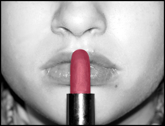
| I like the composition, but in the desaturation, the lipstick looks rather flat and one dimensional, I think. |
|
|
|
02/06/2004 04:17:48 AM |
| The part of the frame around the nose doesn't look right. The textures of the picture in general seem to be a bit off. Skin seems rough and so does the lipstick for that matter. Very good idea. |
|
|
|
02/04/2004 01:14:58 PM |
|
|
|
02/04/2004 02:17:57 AM |
| Her skin has a very dry and patchy look |
|
|
|
02/03/2004 07:21:36 AM |
| Excellent use of desaturation. Love it. |
|
|
|
02/03/2004 03:42:28 AM |
| nice touch in the post editing. |
|
|
|
02/02/2004 10:49:27 AM |
| I like the desaturation and composition. Lighting is too harsh and hot and is clearly visible in the lipstick holder. It has also caused a problem with loss of detail in parts of the cheeks and glare in the lips. It appears like her nose is running. Finally, the visible hairs around the nostrils and cheek are unsightly. |
|
|
|
02/02/2004 03:06:22 AM |
| Good idea. The skin texture is a bit off due to the flash(?) especially noticable to the right of the nose. 5 |
|
Home -
Challenges -
Community -
League -
Photos -
Cameras -
Lenses -
Learn -
Help -
Terms of Use -
Privacy -
Top ^
DPChallenge, and website content and design, Copyright © 2001-2025 Challenging Technologies, LLC.
All digital photo copyrights belong to the photographers and may not be used without permission.
Current Server Time: 04/26/2025 07:44:23 AM EDT.