| Author | Thread |
Comments Made During the Challenge  |
|
|
09/22/2002 09:33:00 PM |
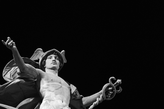
| Fortunately the title doesn't affect my score here, but I think that's Hermes (or Mercury), the messenger of the the gods. Hints are the winged hat and caduceus (staff entwined with serpents -- symbol of the medical profession). |
|
|
|
09/22/2002 06:00:00 PM |
|
|
|
09/22/2002 04:25:00 PM |
| This is a perfect shot - WOW. I wouldn't change a thing, You'll do well with this - 10 - Gotcha |
|
|
|
09/22/2002 03:00:00 PM |
| Good composition but I do not like black as negative space. |
|
|
|
09/22/2002 03:06:00 AM |
| Great statue. I would have liked to see more of it. 6 |
|
|
|
09/21/2002 04:27:00 PM |
| But this is Mercury, isn't it? |
|
|
|
09/21/2002 10:22:00 AM |
I like the stark coldness of this BW. I don't find the composition with the statue positioned so low and to the left adds anything for me, I'd probably prefer it further into the frame, though there is an element of his arms being open to the darkness.
6, Kavey |
|
|
|
09/20/2002 12:13:00 PM |
|
|
|
09/20/2002 09:32:00 AM |
| Technically it is the negative space that is supposed to wow you but still this is to good of a photo not to give it a ten. |
|
|
|
09/19/2002 01:40:00 PM |
| Good photo. fair use of negative space. Excellent texture and detail, |
|
|
|
09/19/2002 09:23:00 AM |
| Love the framing and pov. Great job! 9 Lisa |
|
|
|
09/19/2002 03:47:00 AM |
| cool shot, but what about the negative space? |
|
|
|
09/19/2002 12:01:00 AM |
|
|
|
09/18/2002 08:01:00 PM |
| I could be wrong, but I think that's either Mercury the winged messenger. Nice shot. I don't understand neg. space well enough to comment, so your grade is mostly your photo. 9 Swash |
|
|
|
09/18/2002 12:28:00 PM |
| This is a cool shot. Well done. |
|
|
|
09/18/2002 10:25:00 AM |
| i really like the theme in this photo.. the dark background is also very nice. I'm actually amazed that you were able to get such a brightly lit subject and keep the background this dark. The composition with the subject in the lower portion of the frame is also quite nice... It gives me a strong impression that I'm looking up at this statue. I'm no expert on mythology (or much of anything for that matter), but isn't this Mercury and not Herclues? I thought that Mercury has the wings... maybe those were on his feet though.... good work :) = 9 - jmsetzler |
|
|
|
09/17/2002 10:16:00 PM |
| very nice, striking with the black back ground |
|
|
|
09/17/2002 05:25:00 PM |
| Sorry, I am not that good in Greek deities, but this is rather Hermes than Hercules. But good pic anyway :-) |
|
|
|
09/17/2002 03:06:00 PM |
| not to be a jerk, but i think that's hermes. or mercury. nice shot though. |
|
|
|
09/17/2002 03:05:00 AM |
| I really like thsi one. I like the black "sky"... 7 -lennier |
|
|
|
09/16/2002 11:35:00 PM |
| I would have preferred him loogin the other way. Can you call the sculpture artist and have him do it over? Thanks, that'll be great. - bamaster (8) |
|
|
|
09/16/2002 04:54:00 PM |
| I know some people are probably commenting about the "black negative space". It was talked about in the forums as being uninteresting, or something. However, i really like it here. I think it was applied very nicely. He seems to be welcoming in the darkness. I love the angle and framing. Originality a plus, creativity however is lacking. Very nice that it is not dead center. Lighting worked perfectly for the effect. Overall great job. Good luck in the challenge. 7 ~Hbunch7187~ |
|
|
|
09/16/2002 04:49:00 PM |
|
|
|
09/16/2002 01:38:00 PM |
| mercury? great focus. 8 sgtpepper6344 |
|
|
|
09/16/2002 04:24:00 AM |
Composition: good 6 Lighting: good 6,
Appeal: 5, Total Rating 6 Sulamk
|
|
|
|
09/16/2002 03:55:00 AM |
|
|
|
09/16/2002 01:16:00 AM |
|
Home -
Challenges -
Community -
League -
Photos -
Cameras -
Lenses -
Learn -
Help -
Terms of Use -
Privacy -
Top ^
DPChallenge, and website content and design, Copyright © 2001-2025 Challenging Technologies, LLC.
All digital photo copyrights belong to the photographers and may not be used without permission.
Current Server Time: 03/12/2025 12:33:00 PM EDT.