| Author | Thread |
|
|
10/20/2007 05:01:24 PM |
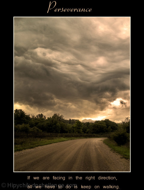
| As a stand alone image, this is great and would of scored higher, I agree the text is the issue here. Dang those clouds are great, really liking where your processing is going |
|
 Photographer found comment helpful. Photographer found comment helpful. |
|
|
09/15/2007 01:22:45 PM |
Beautiful photo. Just one suggestion (and it's a nitpicky kind of one) you needed to place your type just a bit further away from the top (and bottom). It gives the impression of being cut off, even though it wasn't.
The photo was a perfect match to the motivational message. And the photo was a beautiful and moody one. Great find. |
|
| Photographer found comment helpful. |
|
|
09/14/2007 01:49:23 PM |
| Great sentiment and an excellent shot. A better font at the bottom and you'd have an even higher score, I bet. |
|
| Photographer found comment helpful. |
|
|
09/10/2007 05:35:48 PM |
Terry. . ..AWESOME!!!!!!!!
|
|
| Photographer found comment helpful. |
|
|
09/10/2007 10:09:47 AM |
| lovely moody shot, I gave this a 7 - should've been an 8! |
|
| Photographer found comment helpful. |
|
|
09/10/2007 03:40:52 AM |
| Fantastic image Terry, I'm not too keen on the spacing of the bottem text but the image in this poster is excellent. Congrats on the great score as well |
|
| Photographer found comment helpful. |
|
|
09/10/2007 12:09:32 AM |
| Congrats on the beautiful inage and good score, Terry! |
|
| Photographer found comment helpful. |
Comments Made During the Challenge  |
|
|
09/09/2007 05:58:19 PM |
| Great image w message... Love it.. |
|
| Photographer found comment helpful. |
|
|
09/09/2007 02:47:57 PM |
| Nice composition. I love the textures in the sky as well. The text seems a little plain and strangely spaced out. |
|
| Photographer found comment helpful. |
|
|
09/09/2007 02:52:30 AM |
| Great picture, nice poster. |
|
| Photographer found comment helpful. |
|
|
09/06/2007 03:09:40 PM |
| Dramatic sky, good photo. Your bottom text seems too stretched out, too much spacing. |
|
| Photographer found comment helpful. |
|
|
09/05/2007 07:04:11 PM |
| I like this picture, nice capture, but the "poster" configuration is not great |
|
| Photographer found comment helpful. |
|
|
09/05/2007 11:23:59 AM |
| great image, but the type at the bottom is layed out a little odd |
|
| Photographer found comment helpful. |
|
|
09/05/2007 12:00:01 AM |
| Very nice. One of my high voted entries. |
|
| Photographer found comment helpful. |
|
|
09/03/2007 09:25:43 PM |
| What a beautiful sky. Maybe reconsider the layout of the text. |
|
| Photographer found comment helpful. |
Home -
Challenges -
Community -
League -
Photos -
Cameras -
Lenses -
Learn -
Help -
Terms of Use -
Privacy -
Top ^
DPChallenge, and website content and design, Copyright © 2001-2025 Challenging Technologies, LLC.
All digital photo copyrights belong to the photographers and may not be used without permission.
Current Server Time: 04/25/2025 10:54:48 AM EDT.