| Author | Thread |
|
|
09/16/2007 04:35:18 PM |
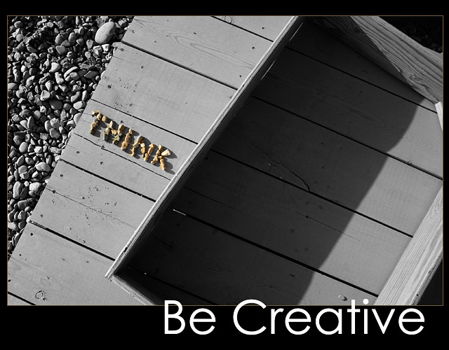
| So glad to see this was from a TSer! Gave it a ten - not just a great idea but a great shot - excellent use of angles and shadows. |
|
 Photographer found comment helpful. Photographer found comment helpful. |
|
|
09/15/2007 01:25:51 PM |
| Deb, this was one of my higher rated shots. I think it is magnificent. The idea was brilliant! AND IMO should have rated much higher. |
|
| Photographer found comment helpful. |
|
|
09/12/2007 08:00:42 AM |
| Great concept....I agree that "THINK" could have been more effective a little larger. Still a great idea and execution. |
|
| Photographer found comment helpful. |
|
|
09/12/2007 12:23:49 AM |
| An underrated shot Deb! But I like the one post's comment that this should be the DPC poster (and t-shirt). I agree! |
|
| Photographer found comment helpful. |
|
|
09/10/2007 12:03:53 PM |
| I didn't even get the joke, duh, and gave you a 9 anyway. I was just thinking something like "think different." I seemed to have gotten the message subliminally. :) |
|
| Photographer found comment helpful. |
|
|
09/10/2007 11:09:06 AM |
| ah, this was yours! great idea, i really liked this one. i jsut wish the 'think' had been a little bigger - not a lot, just a smidge. |
|
| Photographer found comment helpful. |
|
|
09/10/2007 01:22:44 AM |
| "Think outside the box." -- Cool. |
|
| Photographer found comment helpful. |
|
|
09/10/2007 12:11:17 AM |
very creative Deb. You do great even when stuck in a desert. I couldnt think of anything for this and i am not in the middle of a desert.
i really like the lines and textures you created . |
|
| Photographer found comment helpful. |
Comments Made During the Challenge  |
|
|
09/09/2007 08:56:22 PM |
| Lovely abstract with surprise message. |
|
| Photographer found comment helpful. |
|
|
09/09/2007 07:57:56 PM |
| Oooh it's like a Zen photo. I would like to have seen "think" a little more spaced apart. The shadows kind of run the letters together. |
|
| Photographer found comment helpful. |
|
|
09/09/2007 02:29:09 AM |
|
| Photographer found comment helpful. |
|
|
09/08/2007 02:32:30 PM |
| I wish I could vote on this Deb. Ha! I didn't notice that the rocks said "think" when we discussed it in the Critical Mass team thread. I hope it's getting appreciated! |
|
| Photographer found comment helpful. |
|
|
09/06/2007 04:01:10 PM |
| Neat, I like the idea. Good comp, think it needs more contrast. |
|
| Photographer found comment helpful. |
|
|
09/06/2007 07:49:24 AM |
| Deserves a high score, and gets one from me. It is clever even though literal, and certainly elegant and well executed. I hope your reward doesn't require waiting for an OOBIE. Site council should consider licensing this from you to use on DPC T-shirts (in spite of common voting patterns to the contrary) or as a screen-saver. |
|
| Photographer found comment helpful. |
|
|
09/05/2007 07:17:02 PM |
| great idea, very creative. i like this alot, if the letters in the stone were a little bigger i would have loved it! |
|
| Photographer found comment helpful. |
|
|
09/05/2007 07:25:47 AM |
| Excellent idea and interesting POV / composition. |
|
| Photographer found comment helpful. |
|
|
09/04/2007 06:41:13 PM |
|
| Photographer found comment helpful. |
|
|
09/04/2007 11:22:51 AM |
| Deb, I hope folks take the time to see this one. Great composition, and use of the angles. And good job getting the exposure. I would've given this an 8. |
|
| Photographer found comment helpful. |
|
|
09/04/2007 12:53:23 AM |
| This might be even better with title "Be Creative - Think out of the box", but maybe that's implied. If so it's too subtle. |
|
| Photographer found comment helpful. |
|
|
09/03/2007 11:31:31 PM |
| Nice, I like everything about this. |
|
| Photographer found comment helpful. |
|
|
09/03/2007 02:35:22 PM |
| I like the way you're thinking here. A poster that requires a little thought and analysis is a good poster in my book. |
|
| Photographer found comment helpful. |
|
|
09/03/2007 01:39:49 PM |
| Your "Think" needs to be more easily read/bigger rocks? Love the concept and the rest of your composition. |
|
| Photographer found comment helpful. |
|
|
09/03/2007 07:38:14 AM |
|
| Photographer found comment helpful. |
|
|
09/03/2007 05:48:17 AM |
| very nice idea, good composition and layout. "Think" is hardly readable because of the strong shadows. |
|
| Photographer found comment helpful. |
Home -
Challenges -
Community -
League -
Photos -
Cameras -
Lenses -
Learn -
Help -
Terms of Use -
Privacy -
Top ^
DPChallenge, and website content and design, Copyright © 2001-2025 Challenging Technologies, LLC.
All digital photo copyrights belong to the photographers and may not be used without permission.
Current Server Time: 04/27/2025 08:04:31 PM EDT.