| Author | Thread |
|
|
02/09/2004 05:48:38 AM |
| i meant to come back to this and say that despite my comments this was one of my top three in this challenge - that still only garnered you a 7 from me I fear (it just wasn't so striking), but it was clearly among the best. Oddly, all my preferred shots in this challenge were from favourite photographers of mine. |
|
Comments Made During the Challenge  |
|
|
02/06/2004 03:48:50 PM |
| very nice, great focus nice, clean looking image |
|
|
|
02/04/2004 02:50:20 PM |
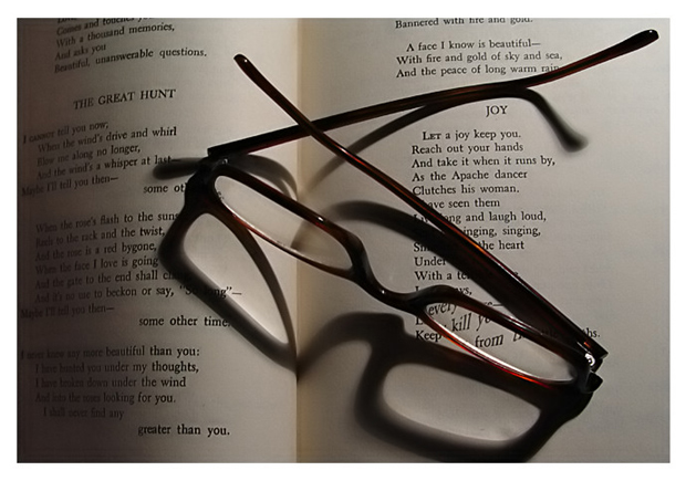
| Great lighting. Lacks something, for me - perhaps only that the truly interesting moment of light is where the page fold is - and that's weak compositionally. Certainly one of the more intersting entries so far though. |
|
|
|
02/03/2004 11:07:18 AM |
| The first thing I notice is that the crease isnt directly in the middle and so that gives a somewhat unbalanced feel. I can see you used the light off to the top right to get the shadow, but that has caused the lower left to be quite dark. The sharpness is good, and the idea works well and certainly meets the challenge. A suggested recomposition would be to move the light to the top of the book, balance up the crease, and place the glasses over both pages and have the shadow falling toward the bottom. |
|
|
|
02/02/2004 12:36:01 PM |
| I like the look of the shadow in this shot. Good combination. Lots of competition with this. Good luck. |
|
|
|
02/02/2004 10:42:54 AM |
-
Message edited by author 2005-04-09 00:02:56. |
|
|
|
02/02/2004 02:50:13 AM |
| There's a nice subdued feeling here. A comfortable scene. I wouldn't have cropped to have the glasses touching the border at the bottom, though. 6 |
|
Home -
Challenges -
Community -
League -
Photos -
Cameras -
Lenses -
Learn -
Help -
Terms of Use -
Privacy -
Top ^
DPChallenge, and website content and design, Copyright © 2001-2025 Challenging Technologies, LLC.
All digital photo copyrights belong to the photographers and may not be used without permission.
Current Server Time: 03/12/2025 02:03:31 AM EDT.