| Author | Thread |
|
|
09/30/2007 11:52:51 AM |
Hello from the critique club
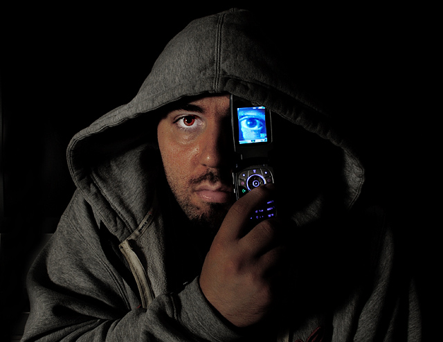
You have a good start in a better looking model than MAK (Hanae's other half)! Only joking if you read this MAK...
This image scored pretty well and you have some good comments already. I think that you did a good job of getting the set up right, and it is definitely recogniseable.
Areas where is falls short of Hanae's attempt are in the lighting a little - you have a yellow tinge (which you could have sorted in post-processing), and the lighting is not as strong. To make light more harsh, you need to use a smaller light source and/or move it further away - but at the expense of brightness (requiring longer shutter times).
Your subject looks a little more crumpled than Hanae's MAK - this distracts a little as the folds lead the eye away from the phone.
You have sharpened your image less than Hanae did - I think that Hanae's image is a little oversharpened, but somewhere in between your images might be my preference.
Good luck with your next challenge.
Cheers
Matthew
|
|
 Photographer found comment helpful. Photographer found comment helpful. |
|
|
09/24/2007 06:24:45 AM |
Thank you for copy my image.
WE know that set up for this shot is not easy... well done! |
|
| Photographer found comment helpful. |
Comments Made During the Challenge  |
|
|
09/23/2007 06:07:02 PM |
| Great idea. Excellent exposure. |
|
| Photographer found comment helpful. |
|
|
09/21/2007 08:25:41 PM |
|
| Photographer found comment helpful. |
|
|
09/21/2007 08:34:32 AM |
| Nice job in emulating the original. Colors and sharpness of details are wonderful! Lighting is well done well but could be better for the right hand side of the model falls too much into shadow - another (dimmed for you don't want to lose too much shadow) light source to evenly light the model will help. My other suggestions on how to improve this above average shot is the framing and pose of the model. I think it would improve visual impact if you zoomed in just a tad closer - bring us closer to the person will show us more details. Lastly the pose of the model has his hand on the phone but his finger covers the buttons. The devil is in the details, I know, but showing us more of the object that is projecting the iMode eye would increase visual impact because it strengthens the visual cues that this is a phone. Have your model cup the outside edges of the phone with his fingers and it will showcase this important element in the composition. Aside from that good job. |
|
| Photographer found comment helpful. |
|
|
09/20/2007 09:02:43 PM |
|
| Photographer found comment helpful. |
|
|
09/20/2007 08:05:06 PM |
| Don't remember the original but yours looks good. Seems like the eye is a smidge too far to the right. 6 |
|
| Photographer found comment helpful. |
|
|
09/20/2007 08:43:20 AM |
|
| Photographer found comment helpful. |
|
|
09/19/2007 04:07:24 PM |
| I really like the lighting on this one as well as the range of dark tones. Excellent effort. |
|
| Photographer found comment helpful. |
|
|
09/19/2007 02:29:52 AM |
| Good try...but the texture of the original is what it pop. |
|
| Photographer found comment helpful. |
|
|
09/18/2007 11:44:02 PM |
| Good shot. I like the lighting on the face, and the color of the 'normal' eye. |
|
| Photographer found comment helpful. |
|
|
09/18/2007 08:30:06 PM |
| Not quite as well lit as the original, but who am I to argue, my entry had the lighting really way off. On it's own, it a really nice shot. |
|
| Photographer found comment helpful. |
|
|
09/17/2007 08:04:42 AM |
| This was one that I had thought about for my submission, but changed. Well done! |
|
| Photographer found comment helpful. |
|
|
09/17/2007 04:57:52 AM |
| very nice replication. although your right eye looks pretty red and it kinda creeps me out. |
|
| Photographer found comment helpful. |
Home -
Challenges -
Community -
League -
Photos -
Cameras -
Lenses -
Learn -
Help -
Terms of Use -
Privacy -
Top ^
DPChallenge, and website content and design, Copyright © 2001-2025 Challenging Technologies, LLC.
All digital photo copyrights belong to the photographers and may not be used without permission.
Current Server Time: 03/14/2025 03:55:02 AM EDT.