| Author | Thread |
Comments Made During the Challenge  |
|
|
09/23/2007 11:15:39 PM |
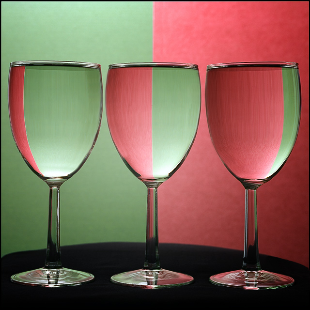
| Good shot, but I don't see a match to the title for comparison. There are several ribbon winners similar to this one but I haven't seen any like this. I like the good focus on the refraction in the glasses and not on the background. |
|
 Photographer found comment helpful. Photographer found comment helpful. |
|
|
09/23/2007 11:15:36 PM |
| Subtle lighting...nice tribute! |
|
| Photographer found comment helpful. |
|
|
09/23/2007 08:30:39 AM |
| Very good attempt. Although I would have liked to have seen a more even edge on the black tabel cover. |
|
| Photographer found comment helpful. |
|
|
09/21/2007 09:53:14 AM |
| Wow, nice lighting and two-tone color refractions in the glass! You have some good colors and a very nice tonal variation in the colors of your composition. My only suggestion is that the it is that the contrast is a little flat. Boast up the Contrast in the Brightness/Contrast levels and it will visually pop even more. Saturation is a tad light. I think the composition would perhaps benefit from a little more deepness and saturation in the tones. Simply playing around with Saturation levels (not too much as that you don't want over-saturation) as well as the Brightness/Contrast levels would really take this from above average to stellar. |
|
| Photographer found comment helpful. |
|
|
09/21/2007 09:20:13 AM |
I like your title, since there are so many ribbons of the same subject. No need to go searching to THE original.
I really like sharpness and the lighting. The almost perfect symmetry is the crowning touch. |
|
| Photographer found comment helpful. |
|
|
09/20/2007 08:45:03 PM |
|
| Photographer found comment helpful. |
|
|
09/20/2007 08:21:39 PM |
| YOu suffer from being the 8 or 9th set of wine glasses I have voted on. Not sure about the rounded table top. 6 |
|
| Photographer found comment helpful. |
|
|
09/19/2007 10:32:59 AM |
| Whilst technically this is very good, very sharp, no lighting glare, composition is spot on. I think the colours and don't work so well, comes across a little dull |
|
| Photographer found comment helpful. |
|
|
09/18/2007 09:08:02 AM |
| looks like a mixture of different pictures, don't know with which one to compare, for itself a nice shot, could be a little more saturated. don't like the irregular black shape here, though |
|
| Photographer found comment helpful. |
|
|
09/17/2007 10:48:11 PM |
| Nicely captured. If I were being super picky, I would fix the table cloth on the left side. |
|
| Photographer found comment helpful. |
|
|
09/17/2007 10:43:02 PM |
| I searched for your title but only 7 shots came up, none of which were like this. If you PM me with the shot you are emulating I'll revisit my vote |
|
|
|
09/17/2007 05:23:28 PM |
| I love the combination of these 2 colours :) |
|
| Photographer found comment helpful. |
|
|
09/17/2007 01:59:39 PM |
| Pretty colors and good use of rule of thirds. |
|
| Photographer found comment helpful. |
|
|
09/17/2007 08:01:33 AM |
| Best of these retakes..... |
|
| Photographer found comment helpful. |
|
|
09/17/2007 07:01:10 AM |
| i needed to see another one of these... |
|
Home -
Challenges -
Community -
League -
Photos -
Cameras -
Lenses -
Learn -
Help -
Terms of Use -
Privacy -
Top ^
DPChallenge, and website content and design, Copyright © 2001-2025 Challenging Technologies, LLC.
All digital photo copyrights belong to the photographers and may not be used without permission.
Current Server Time: 03/14/2025 09:39:26 AM EDT.