| Author | Thread |
Comments Made During the Challenge  |
|
|
09/21/2007 08:56:24 AM |
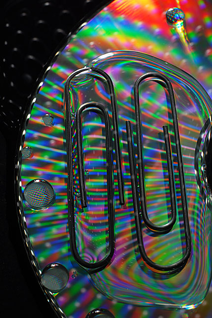
| This is a good attempt at trying to emulate the original. However there are several areas that need improvement to catapult this into an above average shot. First you have the nice psychedelic colors & patterns as the backdrop for the paperclips but they need to encompass the whole backdrop to increase visual impact. Showing the edge of the CD and a black backdrop beyond it breaks up the patterns we see in the prismatic colors. When showcasing one major element you really need to have ONE solid backdrop; adding more just distracts the eye. Perhaps the CD was not a good choice because you don't have alot of space to encompass the paperclips without getting the edge in the picture. Hmmm, just a suggestion since I don't know all the details on the setup on creating this shot: mayhap some holographic or shiny wrapping paper might have done the trick? Next, lighting needs to be better. The paperclips appear just as dark shapes. Using one overhead desk lamp or maybe several light sources around the objects would illuminate them more not to mention minimize or eliminate the shadows thrown off such as the shadow we see on the bottom right paperclip. Lighting them better will show off there metallic sheen. Angle of shooting your subject can greatly increase visual impact. I think it would greatly improve the visuals if you shot this from an overhead looking down angle. The reasons is that it would REALLY showcase the patterns & colors of the background especially within the paperclips. |
|
 Photographer found comment helpful. Photographer found comment helpful. |
|
|
09/19/2007 03:52:31 PM |
| Nicer coloring than the original with the CD under it, but it's missing the great pattern of rings around the paper clips the original had, demonstrating surface tension. What are the bubbles about? It looks like they clips aren't floating like the original but just sitting on the CD. Nice sharp image. |
|
| Photographer found comment helpful. |
|
|
09/19/2007 02:57:51 AM |
| Certainly a different take. Not an imitation...but definitely a tribute as you say. |
|
| Photographer found comment helpful. |
|
|
09/18/2007 08:46:36 PM |
A nice shot, but something just feels wrong with the light. It just doesn't seem to have any brightness to it.
It just doesn't pack the punch of the original. |
|
| Photographer found comment helpful. |
|
|
09/17/2007 06:23:21 AM |
|
| Photographer found comment helpful. |
|
|
09/17/2007 01:36:07 AM |
| Lacks the cleaness and simplicity of Gaurawas original. Good idea to use the CD as BG. 5 |
|
| Photographer found comment helpful. |
Home -
Challenges -
Community -
League -
Photos -
Cameras -
Lenses -
Learn -
Help -
Terms of Use -
Privacy -
Top ^
DPChallenge, and website content and design, Copyright © 2001-2025 Challenging Technologies, LLC.
All digital photo copyrights belong to the photographers and may not be used without permission.
Current Server Time: 03/10/2025 09:46:25 PM EDT.