| Author | Thread |
Comments Made During the Challenge  |
|
|
09/22/2002 11:17:00 PM |
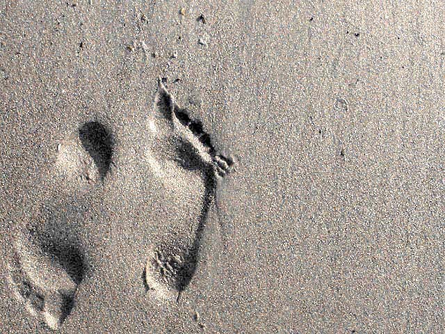
| I really like this. the texture shows nicely, and if you look long enough, you can't tell if it is depressed or otherwise. karmat |
|
 Photographer found comment helpful. Photographer found comment helpful. |
|
|
09/22/2002 11:10:00 PM |
| Interesting "surface of Mars" kind of feeling! |
|
| Photographer found comment helpful. |
|
|
09/22/2002 09:02:00 PM |
| Great shot. I like the way the way the image is molded into the 'negative space'. One of the most original concepts for the challenge, and well done. 9 - chrisab. |
|
| Photographer found comment helpful. |
|
|
09/22/2002 08:33:00 PM |
| Cute! The wit of doing opposite directions is brilliant and creative. NIce texture, meets challenge theme, and nice lighting and shadows. Good luck in the challenge! Grayce aka Gracious |
|
|
|
09/22/2002 08:33:00 PM |
| excellent graphical approach to the challenge...8...hokie |
|
| Photographer found comment helpful. |
|
|
09/22/2002 02:45:00 PM |
| The imprint sometimes fools the eye, like it is higher than the surrounding sand. Not sure whether the emptry space adds a lot to the picture. |
|
|
|
09/22/2002 12:21:00 PM |
| excellent! how did you get the extrusion effect? - 9 |
|
|
|
09/22/2002 09:41:00 AM |
| Very original. Looks kind of grainy! Haha just a joke. I know what sand looks like. |
|
|
|
09/21/2002 12:22:00 PM |
| Apologies for not leaving a proper comment. Please email me if you'd really like one. I�ve voted this image a 7. Kavey |
|
|
|
09/21/2002 10:48:00 AM |
| lovely. the textures work well for me in this - great. |
|
|
|
09/21/2002 07:54:00 AM |
| I like it ! It is really weird how sometimes, not always, I see the foot curved out of the sand. Does verybody get that ? 8 |
|
|
|
09/20/2002 03:18:00 PM |
| Good use of space. Slightly overexposed. |
|
|
|
09/20/2002 12:13:00 AM |
| how did you get reverse indentations in sand? interesting 8 |
|
|
|
09/19/2002 04:45:00 PM |
| i love this shot!!! 8--shutterfly |
|
|
|
09/19/2002 03:39:00 PM |
| This is so cool! I keep trying to figure the footprints out. They don't look like depressions, but they must be. How did you do it? |
|
| Photographer found comment helpful. |
|
|
09/19/2002 02:53:00 PM |
|
|
|
09/19/2002 11:05:00 AM |
| Obviously these footprints cancel each other out...Would have made a great black and white entry.... |
|
| Photographer found comment helpful. |
|
|
09/19/2002 10:29:00 AM |
| I really like this clever use of lilghting and I think the footprints are placed in just the right position to emphasise the expanse of sand andrewm |
|
| Photographer found comment helpful. |
|
|
09/18/2002 11:44:00 PM |
| This strangely changes from positive to reverse/ from a hole to a hill - a wonderful picture, I hope others can see what i see, you will do well with it. |
|
| Photographer found comment helpful. |
|
|
09/18/2002 07:17:00 PM |
|
|
|
09/18/2002 12:42:00 PM |
| I think you should have found an interesting thing on the beach, like a shell, or some interesting patterns in the colour of the sand. Here the sand is just the medium the footprint is in, and doesnt hold any interest in the way other shots using patterns, vivid colours and strong contrasts do. |
|
| Photographer found comment helpful. |
|
|
09/18/2002 07:30:00 AM |
| Superb! It looks like you must have took your time setting this shot up. Really great job! |
|
|
|
09/18/2002 02:28:00 AM |
| Original idea. The right foot pinky toe looks deformed :) Great shot. 8 |
|
|
|
09/17/2002 02:29:00 PM |
very nice :) I really like the negative space here... the indententations in the sand could be considered negative space in themselves... excellent :) - jmsetzler
|
|
|
|
09/17/2002 01:33:00 PM |
| i would say "walking on the other side" cool! |
|
|
|
09/17/2002 05:02:00 AM |
| The feet look like they are coming out of the sand rather than just being foot prints... Really artistic, great effort.. (10) |
|
|
|
09/17/2002 01:59:00 AM |
Nice... I like the foot prints backwards but I like the space around them better.
and great use of thirds! |
|
|
|
09/17/2002 01:31:00 AM |
| Beautiful...you can't tell if the prints are pointing inward or outward. |
|
|
|
09/16/2002 11:18:00 PM |
| Great idea. Like the faint colors in the sand |
|
|
|
09/16/2002 11:02:00 PM |
|
|
|
09/16/2002 10:06:00 PM |
|
|
|
09/16/2002 10:00:00 PM |
| I really like this image, it is one of my favorites for this challenge. I think that it demonstrates creative thinking. In addition, it is a very good exposure and well composed. |
|
|
|
09/16/2002 09:20:00 PM |
|
|
|
09/16/2002 08:16:00 PM |
|
|
|
09/16/2002 05:06:00 PM |
UPDATE: Sorry for the long pause. Busy week! There's a lot I like about this photo. The clever element of the feel opposite each other in direction is really great for drawing attention and pulling you into the photo. The shadows int he footprints are nice, quite natural. The texture of the same is interesting and somewhat calming. (LOL, but true). The sepia tone is nice.
The left foot seems to crowd the edge of the photo a bit, but that's a nitpick. 7, just-married
ORIGINAL COMMENT:
Neat idea. I like it. 6-7, just-married |
|
| Photographer found comment helpful. |
|
|
09/16/2002 04:47:00 PM |
| Right on the challenge here.......well done. Maybe a bit too bright, over exposed some. Still this is good, and speaks loudly. Good luck. Score 7 Justine |
|
|
|
09/16/2002 04:37:00 PM |
| Wonderful! Good use of negative space! |
|
|
|
09/16/2002 01:08:00 PM |
| Good neg spc, and interesting concept. Great composition in my eyes. lhall-7 |
|
|
|
09/16/2002 11:43:00 AM |
| I really like this. Maybe it is just me, but it appears that the footprints are raised instead of "imprinted" in the sand. If so, how did you do this? Definitely one of my favorites. |
|
|
|
09/16/2002 11:28:00 AM |
| the grains of sand--they go backwards and frontwards--nice concept--8bobgaither |
|
|
|
09/16/2002 11:06:00 AM |
| Well, I chose 5 pics with a rating of "10." Of those 5, yours is my favorite. |
|
|
|
09/16/2002 08:52:00 AM |
Composition: Good but not wow, looks better in the thumbnail 6
Lighting: to bright not enough contrast between positive and negative 5,
Appeal: 6, Total Rating 6 Sulamk
|
|
| Photographer found comment helpful. |
|
|
09/16/2002 08:26:00 AM |
| This is one of my favs of the week. I love this one. = 10 Shiiizzzam |
|
|
|
09/16/2002 03:56:00 AM |
|
|
|
09/16/2002 03:05:00 AM |
| Hmmm...I think this would work better as a vertical crop ;oP |
|
Home -
Challenges -
Community -
League -
Photos -
Cameras -
Lenses -
Learn -
Help -
Terms of Use -
Privacy -
Top ^
DPChallenge, and website content and design, Copyright © 2001-2025 Challenging Technologies, LLC.
All digital photo copyrights belong to the photographers and may not be used without permission.
Current Server Time: 03/12/2025 07:52:54 AM EDT.